prelude


PRELUDE is an exhibition to the Belgian Art & Design Fair.

DOWNLOAD CATALOGUE

CURATORS Stefanie Everaert & Caroline Lateur (doorzon interieurarchitecten) Theo De Meyer Tatjana Pieters Christophe Urbain

info


CONTACT

Organisation
info@ijv-ifas.be
+32 9 241 55 00
ijv-ifas.be
Familie van Rysselberghedreef 2 | 9000 Gent | Belgium

DENKTANK

Daan Rau, Johan Valcke, Guillaume Van Moerkercke, Stefanie Everaert, Steven Vercruysse, Christophe Urbain, Wim Lambrecht, Moniek Bucquoye, Jan de Geest, Harry Vanhoyweghen, Caroline Lateur, Theo De Meyer, Mathieu Cieters

SPONSORS


General conditions (NL)

Download PDF

Privacy Policy (ENG)

Download PDF Tent logo

curators

DESIGN

Doorzon interieurarchitecten & Theo De Meyer

Doorzon interieurarchitecten & Theo De Meyer

Stefanie Everaert en Caroline Lateur werken sinds 2005 samen als Doorzon interieurarchitecten. Ze begonnen hun loopbaan in het atelier van Maarten Van Severen en werkten aanvankelijk vooral voor particulieren, van nieuwbouw en verbouwingen tot kleinere ingrepen

zoals maatmeubilair. In de afgelopen 15 jaar heeft hun werkveld zich uitgebreid tot publieke en internationale projecten, tal van wedstrijdontwerpen, scenografieën en tentoonstellingen. Zo cureerden ze in 2016 het Belgisch paviljoen op de Biënnale voor Architectuur in Venetië, samen met architecten de vylder vinck taillieu en Filip Dujardin. Voor het Designmuseum in Gent maakten ze een nieuwe scenografie voor de vaste collectie in samenwerking met het Gentse architectenbureau FELT. Ze stonden niet alleen in voor het ontwerp en de vormgeving, maar cureerden ook de eerste tijdelijke tentoonstelling binnen de nieuwe opstelling. Sinds 2016 werken Caroline en Stefanie beiden als docent aan de KU Leuven (Faculteit

Architectuur, Campus Sint-Lucas Gent). Theo De Meyer is architect en werkt tussen vele praktijken in. Hij is onder meer projectarchitect voor architecten jan de vylder inge vinck en als assistent vebonden aan de ETH in Zürich. Door samenwerkingen met kunstenaar Manor Grunewald en Doorzon interieurarchitecten ontstond onder de naam Theo De Meyer een eigen werkveld, van scenografie over meubel tot architectuur, dat nog steeds uitbreidt. Theo vormt samen met Doorzon interieurarchitecten de kern van het accordeoncollectief Stand Van Zaken, dat door samenwerkingen met specialisten in diverse vakgebieden meubelen en architectuur ontwikkelt. Stand Van Zaken ondersteunt het creëren en ontwikkelt objecten, gebouwen en ideeën vanuit een gedeeld enthousiasme.

Goods Between Floors - Berthold Pott Gallery Keulen

Theo De Meyer voor Manon Grunewald
Goods Between Floors - Berthold Pott Gallery Keulen
F: Alexander Böhle

Keuken HEM

Doorzon interieurarchitecten
Keuken HEM
F: Filip Dujardin

ART

Wim Lambrecht

Wim Lambrecht

Wim Lambrecht (°1973) is Head of LUCA School of Arts campus Sint-Lucas Visual Arts Ghent. In addition to being a lecturer and researcher, he is also active as an artist and curator. He likes to connect different artistic disciplines and brings them to the public in the form of exhibitions, performances, concerts, plays and books, all within a contemporary artistic context. He is also a board member at the HISK (Higher Institute for Fine Arts), Kunsthal Gent and Smoke & Dust/019.

As a curator he made exhibitions at the University Library Leuven, S.M.A.K., STUK, NRW Forum Düsseldorf, Museum dr. Guislain, the Serbian pavilion at the Venice Biennale, the Abtenhuis in Geraardsbergen, the Raveel Museum, etc.

A Whole New World A Go-Go & Erstarrung

Heidi Voet (Installation) & Kris Martin (Print)
A Whole New World A Go-Go & Erstarrung
P: Dirk Pauwels; Courtesy of S.M.A.K

The Prélude Pathétique

Dear Reader
The Prélude Pathétique
P: Dear Reader

participate


COMING SOON

subscribe


Program


Performance by Nina vandenbempt

On Thursday

RITUAL FOR THE LIVING

Sounds colab with Adam Russell
Undergarment: Murielle Victorine Scherre La fille d’o

Come and rest with me
In the shadow
Of the cross, and with cross
I always meant say crossroads

This bed used to be the artist’s bed for years. As an object it saved memories. It was also a place where she was in suicidal purgatory for months during the summer of 2019.

Now it is time to rest in the shadow of the cross, the cross – a crossroad between life and death itself- and read a loud from the exact words she wrote down in her personal journal during those long days.

As a way of celebrating this personally horrifying learning experience and to honour any horrifying experience that comes with being human. With this performance she tries to transcend the past by embodying her ultra-kind higher self that is obsessed with rest and care.

This is an invitation to come and rest with her in the shadow of the cross to honour life.

Performance by Ivan Nylander

On Thursday

Unaccompanied (Sarabande from Suite No. 2 for Solo Cello in D minor, Johann Sebastian Bach, BWV 1008)

Curatortours

by BA&DF

Will you know more about Art & Design?

Book a tour on the fair with our curators Wim Lambrecht, Theo De Meyer, Stefanie Everaert and Caroline Lateur

Friday 8 okt – 18.00
Saturday 09 okt – 14.00
Sunday 10 okt – 16.00

Choose your day and register on Tickets with this code:

Friday 08/10, 18h: ROVR809
Saturday 09/10, 14h: ROZA909
Sunday 10/10, 14h30 ROZO1009

Start to Buy Art Tours

by Kunst Aan Zet

Explore the fair during a 40 minute guided tour full of tips & tricks about buying art & design, from developing your own taste to the presentation in your home and all the steps in between.

Book your tour at kunstaanzet.be

  • Friday 17h30
  • Saturday 12h00 and 16h00
  • Sunday 14h00

Start to Buy Art Tours are for free and start at the Kunst Aan Zet booth.

Between. Sometimes.
Mostly. Often. Probably. Presumably. Rather.
Simultaneously. Always. Perhaps. Also. Or. Together. In between. More. With. Without. And.

The Belgian Art & Design Fair celebrates creation – somewhere between art and design. But especially creation as such, without necessarily categorizing it. Sometimes this. Sometimes that. Mostly in between.

BELGIAN — as to the gaze.
BA&DF focuses on the work of Belgian artists and designers. Often noticed abroad, they are just as often overlooked in their own country. Our gaze is Belgian, without necessarily defining what exactly this Belgian gaze stands for. Because it probably cannot be defined. As it probably does not want be to either. It would rather exist as a contradiction. And embrace that contradiction.

ART — on the one hand.
The term art refers to a domain. A collection of disciplines. A field. At the same time, the art world never stops changing. With constantly innovating collaborations between artists, galleries, exhibition organizers, collectors, patrons and curators. BA&DF wants to give this complexity a chance to show and develop itself. With like-minded and dissenting people – perhaps mostly dissenters. With Wim Lambrecht as curator.

DESIGN – On the other hand.
The term design also refers to a domain.
A field of expertise. A craft. With creators, designers, crafts, companies and producers. With story-telling objects. Handmade or high-tech. Functional or aesthetic. Unique or in series. And preferably: all of the above. With Doorzon interior architects and Theo De Meyer as curators.

FAIR — as a place.
The fair as a show. As a meeting. As a celebration. In the Floralies hall in Ghent. With a scenography of tents — to keep dry, and to gather under one roof. A tent with a square for furniture. And works of art. A tent with rooms and walls for galleries and shops. A tent for a market, with objects on tables. And much more in between. Scenography by Doorzon interior architects and Theo De Meyer.

BA&DF as a funfair for art and design. Two different worlds. With many more worlds in between. Sometimes with each other. Sometimes without. But above all, with and without taken together.


text: Bart Decroos

tickets


buy your ticket
register an invitation
Online tickets €10,00 One-time access
At the entrance €18,00 One-time access
Guide for disabled people FREE
Students €7,00 One time access, on presentation of student card at the entrance
Students groupStarts from 15 persons €7,00 Reservation by mail at loic@2021.ba-df.be, attendant free entrance
Kids under 16 years old FREE

Buy your ticket.
Purchased tickets cannot be returned and/or exchanged.
If you recieved an inviation please register to get your ticket.

Tent logo

news


More soon

Start to Buy Art Tours by Kunst Aan Zet


Start to Buy Art Tours by Kunst Aan Zet
go back

Start to Buy Art Tours by Kunst Aan Zet

Explore the fair during a 40 minute guided tour full of tips & tricks about buying art & design, from developing your own taste to the presentation in your home and all the steps in between.

Book your tour at www.kunstaanzet.be/evenementen

  • Friday 17h30
  • Saturday 12h00 and 16h00
  • Sunday 14h00

Start to Buy Art Tours are for free and start at the Kunst Aan Zet booth.

Discover the future at the ‘Belgian Art & Design Fair’


Discover the future at the ‘Belgian Art & Design Fair’
go back

Discover the future at the ‘Belgian Art & Design Fair’

We present work of two media artists:

• Katinka De Jonge & Collection of Doubts
• Mariska De Groot & Crochet

They show creations where emotion, sensation, material and craftmanship come together.
The works are exhibited in a box, away from the hustle. In this space all your senses will be stimulated, so that you can experience the deepness of the works.

Exhibitors


Kunst In Huis

GALLERY KUNST AAN ZET
go back

Kunst In Huis

Kunst In Huis

Are you interested in contemporary art, but do you find it difficult to “get started”? Kunst in Huis works like a library where everyone can borrow works of art. An ideal formula for discovering the fascinating work of contemporary Flemish artists and hanging it in your own home. And what if you fall in love with a work of art and you don’t want to give it back? Then maybe you’ll buy it!

Today, the collection of Kunst in Huis counts about 5,000 works by 400 current artists who live and work in Flanders. The collection aims to provide a picture of all contemporary visual art movements in Flanders. We regularly enrich the collection with new artists and works of art.

Kunst in Huis has four branches where you can register, choose, reserve, exchange and buy. You can find us in Antwerp, Ghent, Brussels and Leuven.

In this way Kunst in Huis makes a wide range of contemporary art forms accessible and gives starting artists a helping hand. Moreover, a work of art is never ‘just’ lent out, but you also get to hear the artist’s story when you borrow a work.

READ MORE

Maxime Prananto

ARTIST
go back

Maxime Prananto

Maxime Prananto

Untitled perhaps functionally and formally mostly resembles a column.

It is brought into tension
between floor and ceiling, organizes the room and reads its precise height from a scale.
Sectionally, the iconic I-beam is mirrored by a counterfeit composite of two T-sections, manufacturing both balance and opposition.

Its internal rigour juxtaposes an unavoidable surrender to the space it is in.

At first glance, the object seems archetypal. At second sight, it can only be seen as selfsabotaging.

MAXIME PRANANTO runs a practice of interventions in architecture and art spaces.
It deals in simultaneous design and production of scenography, exhibitions, furniture and objects.
All interventions reflect a sensitivity to the beauty of constraints and gather meaning throught the
entirety of their process.

Part of F / A Fake Authentic

READ MORE

Matteo Bimbi

ARTIST
go back

Matteo Bimbi

Matteo Bimbi

Santella, one of the italian terms for shrine, is an object that toys with the idea of sacred site, presenting in a profane and ironic way the motif, common in many religions and mythologies, of the “world tree” or “axis mundi”, the connection between Heaven and Earth.
A juxtaposition of archetypical shapes and ordinary objects, Santella is a weird domestic monument that emphasizes and ritualizes gestures like charging the phone. But don’t expect it to actually function. At best the socket may represent a spiritual connection of some kind, because after all, as religions teach, faith is all that matters.

Formed as an architect, he operates within the broad field of design. His work revolves around the relationship between tradition and modernity, always keeping a critical and disillusioned eye on contemporary society issues. For his projects he employs different materials and techniques, ranging from traditional craftsmanship to industrial know-how, often mixing the two.

Part of F / A Fake Authentic

READ MORE

Marco Barazzuoli

ARTIST
go back

Marco Barazzuoli

Marco Barazzuoli

As for the acoustic phenomenon in which the sound, reflecting against an obstacle, returns to be heard at the point where it was emitted, ECHO is a project on the return, on the rediscovery of old and new waste from marble processing.
Everything starts from the travertine slab which is placed under the blocks for the cutting operation. This slab, when it is removed from the machine to be eliminated, has a three-dimensional texture given by the randomness of the multiple cuts.
By combining various marble slabs of different colors and sizes and travertine, motifs of vertical and horizontal lines are created, which give life to a set of both tactile and visual graphics.
A desecrating process that tends through the recovery of waste, to give a new value to one of the most
iconic materials of architecture and art.

MARCO BARAZZUOLI, designer and artist. His work is distinguished by a careful choice of materials, aimed at enhancing their characteristics, also thanks to contrasting their combinations.
CARLOS BERRETTINI, marble craftsman. Third generation of ARS MARMI, a company based in Siena born as a laboratory in 1910, and which for over 25 years has been involved in the processing of stones and marble, collaborating with international architects, designers and artists.

Part of F / A Fake Authentic

READ MORE

Lucia Amaddeo

ARTIST
go back

Lucia Amaddeo

Lucia Amaddeo

Foto dal finestrino was a Domus column edited by Ettore Sottsass.
A collection of instant photos of worlds and realities described in an immediate and essential way.
An almost casual succession of themes and reflections on the loneliness, the traditions around the world and the traces left by humans.
An ode to travel.
I have kept Sottsass’s little book since fourth grade and when I feel I have lost my focus, I always go back to it, leafing through it.
During these months of pandemic, I felt distant and isolated, and I found myself looking at the world from the window. A window that has often become a video call, an Instagram story or a photo taken by someone. A way to peek into other people’s lives without really being part of it, a way to feel closer to
everyone.
Foto dalla finestra is a collection of 19 drawings,
19 shots through windows, starting from Bergamo and arriving in Milan.

LUCIA AMADDEO is an architect, illustrator and food designer who loves to draw and who is currently based in Zurich.
She works organically in the field of architecture and food design using drawing as a communication tool. Drawing is for her a method of analytical deconstruction of reality into surfaces, textures, and lines to be transformed into a world of dreams and magic.

Part of F / A Fake Authentic

READ MORE

Tom Volkaert

ARTIST
go back

Tom Volkaert

Tom Volkaert
READ MORE

Dennis Ceylan

ARTIST
go back

Dennis Ceylan

Dennis Ceylan

The series ‘Laventa’ is inspired by the colossal stone heads of the pre-Colombian culture of the Olmecs, such as those found in La Venta, Mexico. These stone heads are in reality a round shape with the distinctive senses of the kings who ruled in their respective periods. I reworked this concept of these historical images starting with building a ’round’ shape and finally adding my versions of the senses. The ears , eyes, nose and mouth, starting from what I know, or rather, what my hands know. These sculptures are therefore not based on a live model, but more like a subconscious self portrait.

READ MORE

Ran De Vos

ARTIST
go back

Ran De Vos

Ran De Vos

‘The Original Memory Object Matching Game’

The honor of your presence is requested for a Table Tennis Match on Thursday,
the seventh of October 2021, nine thirty in the morning at my place.
Yours sincerely,
Ran De Vos

A very efficient and well executed display which seems to have been built up along a fruitful and dense reflection but also a playful interest in manipulating material – casts – characters, references, narratives. The display as much as the editorial projects create a framework of great potential for further explorations on how some ordinary artefacts could be reinvested ad libitum in theatrical plays.
— Esther Le Roy, Goda Budvytytė and Yohanna My Nguyen

‘The Original Memory Object Matching Game’ is the graduation project of Ran De Vos (°1999) in which she strategically combines her education in graphic design with personal memories and the technique of mold casting.

instagram.com

SONY DSC

READ MORE

Dries Otten

ARTIST
go back

Dries Otten

Dries Otten

Dries Otten is a studio for furniture design, interior architecture and scenography based in Antwerp, Belgium. Dries Otten is known for his commitment to color and an ability to design playful joinery. He uses a no-nonsense approach, resulting in clear forms in search of the archetype.
Knowledge of, and the sensations from materials, the historical framework, contrasts of color and constructional simplicity are central to Dries Otten’s designs.
It’s all about the design as an enjoyment

READ MORE

Maniera

GALLERY
go back

Maniera

Maniera

MANIERA gallery commissions architects and artists to develop furniture and objects for use, offering them the opportunity to take an excursion beyond their usual practice. Architects often have a close relationship with the visual arts and artists are often inspired by the spatial environment. MANIERA crystallises these affinities into new design proposals. More than just furniture, the objects produced by MANIERA are a deliberate search for confrontations between the realms of architecture, design and art.

MANIERA brings both up-and-coming and well-established figures to the fore. What they all have in common is a personal language and hand, a conceptual mode of thought, and an authentic and idiosyncratic ‘maniera’ or working method.

MANIERA was founded by Kwinten Lavigne and Amaryllis Jacobs in 2014.

READ MORE

Atelier Leda

ARTIST
go back

Atelier Leda

Atelier Leda

Atelier leda is multiple, vivid colour atelier established by leda devoldere in 2019 and based in gent, belgium.
She is focussing on textiles within design, interior, art & in betweens.

READ MORE

HISK

ARTIST
go back

HISK

HISK

HISK offers a post-academic course in visual arts and provides young artists from Belgium and the world with a workspace and pedagogical guidance for a duration of two years. The emphasis at the HISK lies on individual practice and close contact with a community of distinguished visiting lecturers – artists, writers, curators and scholars. Based on diversity of artistic practices and positions, the unique HISK concept gives the artists every opportunity for critical research within a broader aesthetic, social and political context.

At the end of the two years, the participating artists receive a certificate as a ‘Laureate of the Higher Institute for Fine Arts.’ 258 laureates have graduated from the institute since 1997. The majority of them are now pursuing successful professional careers in the international art world.

HISK is officially recognized as a higher educational institute and is financed by the Flemish Community (the Ministry of Education) and supported by the City of Ghent.

Participating artists:
Dries Boutsen
Nelleke Cloostermans
Manu Engelen
Oscar Eriksson Furunes
Antoine Goossens
Nokukhanya Langa
Zhixin Liao
Linda Jasmin Mayer
Ivan Nylander
Edouard Pagant
Elisa Pinto
Juan Pablo Plazas
Paulius Šliaupa

READ MORE

architectenjdviv

ARTIST
go back

architectenjdviv

architectenjdviv

Universum Carroussel Journey is the alter ego for architecten jan de vylder inge vinck/inge vinck jan de vylder architecten. Maybe this alter ego is even the primo ego. No more than three words. And actually only three words. But no more than three words are needed to situate what A JDVIV / IVJDV A should be about when the idea of architecture should be given perspective.

READ MORE

Nina Van Denbempt
BruthausGallery

GALLERY ARTIST
go back

Nina Van Denbempt

gallery: BruthausGallery
Nina Van Denbempt

RITUAL FOR THE LIVING

Sounds colab with Adam Russell
Undergarment: Murielle Victorine Scherre La fille d’o

Come and rest with me
In the shadow
Of the cross, and with cross
I always meant say crossroads

This bed used to be the artist’s bed for years. As an object it saved memories. It was also a place where she was in suicidal purgatory for months during the summer of 2019.

Now it is time to rest in the shadow of the cross, the cross – a crossroad between life and death itself- and read a loud from the exact words she wrote down in her personal journal during those long days.

As a way of celebrating this personally horrifying learning experience and to honour any horrifying experience that comes with being human. With this performance she tries to transcend the past by embodying her ultra-kind higher self that is obsessed with rest and care.

This is an invitation to come and rest with her in the shadow of the cross to honour life.

Although graduating as an Illustrator at LUCA School of Arts, Gent in 2013 Nina Van Denbempt (°1989) works with mixed media. Whether it is painting, painting over old paintings, redesigning jackets, collecting old paper, writing, sculpture, building a shrine at home, playing music, making performances with friends or drawing short comics… It’s all in the purpose of trying to keep a naive curiosity in ways of expressing oneself combined with a mild obsession with the uncomfortableness of being a human in the world. She’s always looking for ways to enhance connection by sharing personal stuff as an antidote for irony and as a way to personally break free from the numbing effects of fear and shame. Recurring themes as anxiety, failure, shame, crushes, existential dread, loneliness, mental health and feminism are very close to her being and are a part of processing her own life events. Mix a deep love for DIY, glitters and pop culture with some darkness and depression and there you have it.

READ MORE

Elke Van Kerckvoorde

ARTIST
go back

Elke Van Kerckvoorde

Elke Van Kerckvoorde

Elke Van Kerckvoorde (b. 1992, Ghent) graduated as a Master of Painting from LUCA School of Arts in 2014, but grew up in a world of logos, design programs and printmaking.
Van Kerckvoorde distorts graphic elements from the everyday world into a geometric imagery and finishes them in a seemingly machine-like way with industrial materials.
This eclectic way of working creates a fascinating play of forms with layered meanings.

With “Series C.R.,” Van Kerckvoorde pays a vivid homage to her deceased mother, herself a graphic designer.
In the paintings, the lively circle and the symbolic cross provide a colourful geometric play of forms in which the combinations look endless.

Elke Van Kerckvoorde is represented by Gallery De Ziener.

READ MORE

Niels Vaes

ARTIST
go back

Niels Vaes

Niels Vaes

This is the water and this is the well.

Photo: Dirk Pauwels

Niels Vaes pulls freely from a multitude of –personal, historical, social, and political– sources, creating a visual language that is simultaneously rich and economical, sensitive and controversial. In his work, an important topic is that of the ever changing landscape. It can refer both to the tangible landscape of nature as the broad range of different cultures.
In his own culture, Niels struggles with the black Pete tradition that is still present in Belgium and the Netherlands. He grew up with the character as a child and even played him when he was older. Therefore, he loved him… He is also aware that the form of how Black Pete is depicted, as a black slave (earrings, red lips, frizzy hair, page suit) is wrong and racist. Niels is visually researching where the tradition is coming from, what the core is and what symbols we can keep or throw overboard. During his research he discovered that one of the characters Black Pete originated from is the Water Nekker, a ghost that lived in waters. People told stories about the ghost to scare children so they didn’t come to close to the water and drown. This ‘evil’ ghost existed to keep children safe. This raises questions about what is evil and what is good. Niels believes good can coexist besides evil and serve a purpose. What you see is an interpretation of the Water Nekker, depicted as a tragicomic clown that fell on his ass. Is he struggling of laughing? Maybe both. He is definitely not human. He is a personification of something we fear. The core of this tradition is that children can conquer their fears and get one step closer to adulthood. The form Black Pete exists in now contributes nothing to this purpose.

nielsvaes.com

© Dirk Pauwels

READ MORE

Onbetaalbaar

ARTIST
go back

Onbetaalbaar

Onbetaalbaar

ONBETAALBAAR began in late 2012 as an artist and designer collective. Several artists, (graphic) designers, writers and illustrators collaborated on projects concerning the reuse of waste. We organized auctions and other sales performances, projects in elderly houses, worked with children,… These projects invite people to look at discarded materials in a different way and spread a sustainable, ecological ideology. Typical for ONBETAALBAAR is the passport that we gave to each self-made object. This gives it an identity with a unique life story, the design idea, the working method and the time spent making it. In 2017, CAMPO arts center offered ONBETAALBAAR its own place in Bomastraat in Ghent, that we share with fellow makers. Here we explore materials, invent and develop prototypes and look for a more circular way of working .
We now focus on prototyping, material research and interior design. By focusing even more on reuse and implementation of sustainable and circular materials, we enrich our style. For us, honoring the history of spaces goes hand in hand with bringing new life to them by reworking them and giving them a different, more ecological identity. ONBETAALBAAR presents an overview of new unknown materials to future clients. We support new circular producers by developing their materials through applications and user experiences.

WASTE isn’t WASTE until you WASTE it.

The Bowie is a unique, simple floor and table lamp with a recognizable sharp angle. The lamp is available in black, white and brown stained wood and each has a unique marble base made from a discarded bedside table or an old fireplace.
The Boy table top of this trestle table rests on the two elegant three-pronged panels, made from remnants of hardwood and plywood. Due to the double conical shape of the triples, this table has an elegant shape and maximum seating comfort. In addition, you can easily store the table for flexible use of your interior.

READ MORE

Vormen

ARTIST
go back

Vormen

Vormen
Vormen is a Belgian collective that creates and produces furniture, objects and projects. In their atelier – the core of their occupation – they translate essential ideas about design and furniture into seemingly simple objects. The final result – a chair, table, mirror, lamp – is obtained through a combination of a thorough love for the artisan making process and a respect for both matter and functionality.
Each member of vormen has his own experience in creating. These diverse and multilayered backgrounds are deeply imbedded in the DNA of vormen.
The collective consists of Edouard Devriendt, Emile Duyck and Leon Duyck.
READ MORE

Comte/Meuwly

ARTIST
go back

Comte/Meuwly

Comte/Meuwly

«The fine rain stopped falling towards the end of the afternoon, the sky became clear. I was hungry and was delighted to be hungry, for now Zorba would come and light the fire and begin the daily ritual of cooking. “Another of these things that never leave you alone,” Zorba often said, as he set the pot on the fire.
[…]
On this coast I felt for the first time what a pleasant thing it could be to have a meal. In the evening Zorba lit the fire between two stones and did the cooking. We started eating and drinking, the conversation became animated. I at last realised that eating was a spiritual function and that meat, bread and wine were the raw materials from which the mind is made.
[…]
His eyes lit up, he was brim full of memories, wings grew on his feet and he danced. “Tell me what you do with the food you eat, and I’ll tell you who you are. Some turn their food into fat and manure, some into work and good humour, and others, I’m told, into God. »

Níkos Kazantzákis, « Zorba the Greek »

READ MORE

RBRTBRBR

ARTIST
go back

RBRTBRBR

RBRTBRBR

RBRTBRBR is a Croatian architect currently based in Ghent (BE). In his work, he is searching for a certain atmosphere through manipulation of architectural elements, their scale, the materiality, the in-between. Atmosphere as a concept rather than a consequence. He is interested in ambiguous architecture or object that is not giving you the answer but rather stimulating question. He makes objects that originate in architectural projects, ending up somewhere between sculpture and usable furniture.

READ MORE

Numbered By Manor Grunewald

ARTIST
go back

Numbered By Manor Grunewald

Numbered By Manor Grunewald

Numbered By is a platform focused on creating unique sweatshirts in collaboration with Belgian contemporary artists. The art practice of the artists is further refined and results in unique wearable artworks.

The collaboration creates an interaction between Numbered By and the artists exploring the boundaries between art and fashion.

‘The digital noise in the artworks thus becomes a kind of textile itself’
— Manor Grunewald

Numbered By invited Manor Grunewald to create 30 unique artworks. It is a study of shape, color and graphic elements within the A3 format. Each collage is available on sweatshirt in different sizes S, M, L and XL.

READ MORE

Arthur Dekker

ARTIST
go back

Arthur Dekker

Arthur Dekker

Arthur Dekker (°1988) combines carpentry and steel. Apart from his atelier, Arthur is developing furniture trough the experiment of the making.

BRIDGE,
1. Fixed or movable connection between two points
2. Provides possibility of approach, advance, approximation
The superstructure consists of feet, legs, the span and the plateau:
Feet: on the ground, in the ground.
Legs: supportive, at height.
Span: carrier of the plateau
Plateau : support for the light and the heavy.
These four parts all together provide the connection between points, cities, roads possible. And therefore between people. Big, small, wide, narrow, twelve lanes or just a single one. I myself, prefer a single lane, just before the bend. Where one has to look over the bridge, where one has to slow down in order not to go off road, to be able to see who or what is on the other side, to find out how to make the crossing. By imposing himself for example or rather patiently, fearfully. By going out of control while singing his favourite song.
All this, you can also say about a table, a stately symbol.

READ MORE

Guillaume Van Moerkercke

ARTIST
go back

Guillaume Van Moerkercke

Guillaume Van Moerkercke

Through sketchings in a sketchbook, I try to better fix moments, taking the time to understand a specific place and to take it in. Withdrawing from the ephemeral, this is how I try to better hold on to that moment in order to remember it later.

Because memories often fade away very quickly. Even though we think we still remember things well, we lose details over time. Sometimes stories and/or photos can refresh them, but only for a time.

Later, in my studio, I capture this process, when I try to fix a memory on paper with charcoal. First I draw the image as expected. Then I leave it there and start to blur it. Until the paper is saturated and the black can’t get any blacker. Or, when a memory is fragmented, I might use several sheets of paper overlapping the memory.

I try to create an image as if the viewer just turned off the light in the room and had to find his way through the dark. After some time, his eyes get used to the dark, and he starts to distinguish small nuances within the space. My work acts in the same way: the longer you look at it, the more you discover of my memory.

READ MORE

V/MSP Gallery

GALLERY
go back

V/MSP Gallery

V/MSP Gallery

Lieven Lefere lives and works in Gent

Ratio and subjectivity as well as the appearance and disappearance of the image is one of the central themes in Lieven Leferes oeuvre. He is primarily interested in the formal aspects of photography and uses his camera not simply as a tool to document his environment. In doing so, he questions the position of the photographer, who can steer our perception with the choice of an image and thus manipulate parts of our reality.
The works Mirroir are from a series in which Lefere examines measure and perspective that Jan van Eyck used in his paintings. For this he reconstructed the church space from “Madonna met kanunnik Joris van der Paele” (Jan van Eyck, 1493) in his studio. The two works Des ombres et des miroirs are showing details that he re-photographed from the resulting work La miroir des ombres. Using this technique, he generates a soft, painterly effect in his photography.

Johan Gelper lives and works in Gent

Gelpers’ sculptures often grow over a long period of time, sometimes waiting for years for the missing link to be added. Constructed from Objets trouvés and items which are charged with a more personal signification, Gelper lets them correlate in a way whereby objects and shapes often contrast in their materiality. They are playful and display a crude elegance, incorporating various philosophies from Dadaism over Constructivism to Pop Art and seamlessly blend those styles.

Philip Lumai lives and works in Brussels

Philip Lumai. uses multiple painterly references to experiment with the regeneration and suggestion of form in abstract painting, whilst continuing to treat process and idea as singular movement of artistic expression as in his earlier monochrome works. Speaking of his work Phil Lumai says that he is looking to re-evaluate the ways in which ideas of form have been treated in abstract painting: “Although I begin with a very specific idea that evolves over a considerable time, eventually I think of it like a discarded sheet of sketches that, whilst presenting no formal solution, also renders up something intriguing that is quintessentially painting“.

vmsp.gallery

Lieven Lefere: Des ombres et des mirroirs II + I

Johan Gelper: Constellation with abstract head

Philip Lumai: Proximity

Philip Lumai: Side Step

READ MORE

Johan Gelper
V/MSP Gallery

GALLERY ARTIST
go back

Johan Gelper

gallery: V/MSP Gallery
Johan Gelper

Gelpers’ sculptures often grow over a long period of time, sometimes waiting for years for the missing link to be added. Constructed from Objets trouvés and items which are charged with a more personal signification, Gelper lets them correlate in a way whereby objects and shapes often contrast in their materiality. They are playful and display a crude elegance, incorporating various philosophies from Dadaism over Constructivism to Pop Art and seamlessly blend those styles.

Johan Gelper lives and works in Gent

vmsp.gallery

Constellation with abstract head

READ MORE

Philip Lumai
VMSP

GALLERY ARTIST
go back

Philip Lumai

gallery: VMSP
Philip Lumai

Philip Lumai. uses multiple painterly references to experiment with the regeneration and suggestion of form in abstract painting, whilst continuing to treat process and idea as singular movement of artistic expression as in his earlier monochrome works. Speaking of his work Phil Lumai says that he is looking to re-evaluate the ways in which ideas of form have been treated in abstract painting: “Although I begin with a very specific idea that evolves over a considerable time, eventually I think of it like a discarded sheet of sketches that, whilst presenting no formal solution, also renders up something intriguing that is quintessentially painting”.

Philip Lumai lives and works in Brussels

vmsp.gallery

Philip Lumai: Proximity

Philip Lumai: Side Step

READ MORE

Lieven Lefere
V/MSP Gallery

GALLERY ARTIST
go back

Lieven Lefere

gallery: V/MSP Gallery
Lieven Lefere

Ratio and subjectivity as well as the appearance and disappearance of the image is one of the central themes in Lieven Leferes oeuvre. He is primarily interested in the formal aspects of photography and uses his camera not simply as a tool to document his environment. In doing so, he questions the position of the photographer, who can steer our perception with the choice of an image and thus manipulate parts of our reality.

The works Mirroir are from a series in which Lefere examines measure and perspective that Jan van Eyck used in his paintings. For this he reconstructed the church space from “Madonna met kanunnik Joris van der Paele” (Jan van Eyck, 1493) in his studio. The two works Des ombres et des miroirs are showing details that he re-photographed from the resulting work La miroir des ombres. Using this technique, he generates a soft, painterly effect in his photography.

Lieven Lefere lives and works in Gent

vmsp.gallery

Lieven Lefere: Des ombres et des mirroirs II + I

READ MORE

Maison Éclectique

ARTIST
go back

Maison Éclectique

Maison Éclectique

“Oh, what a wonderful world…”

‘Maison Éclectique’ started in collaboration with international editor Desplans a presentation of carefully selected quality prints of never before published architectural drawings from Benelux and international architects. Maison Eclectique prints limited editions on quality and durable paper. Prints comes as authenticated, numbered, limited editions with a certificate signed by the architects.

Architects and designers are constantly producing creative drawings and designs. Only a small percent of these makes it into the public domain, although they are an important part of the profession. There are hundreds of sketches, photographs, collages, floor plans, watercolours, cross-sections and models in architect’s offices… of unfinished architecture or design who are the abstract and/or stylized beginnings of a project. For the selection of architectural drawings, plans, watercolours, photographs, etc. ‘Maison Éclectique’ & Desplans works together with experts.

The first selection includes works of: Doorzon Interieurarchitecten, architect Theo De Meyer, architect Gaston Eysselinck (1907- 1953), architect Koen Deprez, architect Charles Vandenhove(1927 – 2019), Pierre Escobar, Traumnovelle, Opera Vari, Point Suprème, Laurent de Carnière, Beau architects a.o.

READ MORE

KopecVerstraete

ARTIST
go back

KopecVerstraete

KopecVerstraete

KopecVerstraete are interested in generating thought-provoking multidisciplinary research, attempting to tackle vast cultural questions seeking for new perspectives rather than defined answers. Their metaphorical prototypes represent a search for a clarity of thought, oscillating between materiality and concept, experiment and pragmatism.

READ MORE

Arthur Vandergucht

ARTIST
go back

Arthur Vandergucht

Arthur Vandergucht

I started to explore and redefine the fixed values with regard to a stool – as the most common entity of furniture design – through design research. Starting from a square seat, the design was shaped by using repetitions, inversions and inflections. The object can thus form part of a series.
The design research focused on developing, explaining and questioning design strategies from the overlapping field between design and architecture; a field that is made present by further examining connections and constructions.
The structure consists of the following components; three legs, three reinforcements and the seat. These components are attached to each other by means of rivets that are attached to the inside, so that the connection gets an extra dimension.

{"subsource":"done_button","uid":"5CBAC073-28B8-40EA-8A9B-CABA23BDDE1A_1630923579725","source":"other","origin":"gallery","is_remix":false,"used_sources":"{"sources":[],"version":1}","source_sid":"5CBAC073-28B8-40EA-8A9B-CABA23BDDE1A_1630923580978","premium_sources":[],"fte_sources":[]}

READ MORE

Guy Vandenbranden
Callewaert Vanlangendonck Gallery

GALLERY ARTIST
go back

Guy Vandenbranden

gallery: Callewaert Vanlangendonck Gallery
Guy Vandenbranden

Guy Vandenbranden

1926 (Brussels, Belgium) – 2014 (Antwerp, Belgium)

Guy Vandenbranden was an important constructivist artist of the Belgian post-war art scene. Following Piet Mondriaan and Victor Vasarely, he attained total geometrical abstraction.
He assumed a key role in the international art scene of the late fifties, where he befriended artists like Lucio Fontana, Piero Manzoni, Yves Klein, Günther Uecker and François Morellet.

From 1951 onwards, Guy Vandenbranden started to work in a lyrically abstract way. In the Brussels art scene and became friends with Pol Bury, Jo Delahaut, Kurt Lewy, Jean Rets and Jean Milo. He joined the artists’ group “Art Abstrait” in 1956. Vandenbranden worked completely in a geometrically abstract fashion from 1954 on and practised this visual language consistently until his death in 2014. Around 1958, Vandenbranden worked in black and white mainly, his artworks almost evolving to monochromy and there was a clear connection with the work of the American Hard Edge of that time. From 1961 onwards, Vandenbranden started working with relief and his first abstract sculptures were created. From 1967 onwards he started to spray cellulose lacquer directly on panels with the aim to create visual illusions (akin to the Op Art).

In 1960, Vandenbranden, Jef Verheyen and Englebert Van Anderlecht established the New Flemish School . This artists’ group, including Paul Van Hoeydonck, Jan Dries and Vic Gentils, aimed to promote their art internationally with exhibitions in Germany, Switzerland and Italy.

Vandenbranden was part of several art movements: Art Abstrait, Formes and Art Construit. He had lifelong artistic friendships with Jef Verheyen, Vic Gentils and Walter Leblanc. He increasingly exhibited abroad (Switzerland, Italy, Germany and The Netherlands), where he befriended artists from the ZERO group.

READ MORE

Callewaert Vanlangendonck Gallery

GALLERY
go back

Callewaert Vanlangendonck Gallery

Callewaert Vanlangendonck Gallery

Callewaert Vanlangendonck Gallery, founded in 2012 in Antwerp, Belgium, displays lyrical and geometrically abstract artists from the following groups: Cobra, Art Abstrait, Art Construit, Formes, G58, the New Flemish School and the ZERO movement.

Gallery owners Brecht Callewaert and Yoeri Vanlangendonck emphasize the importance and the contemporary character of the Belgian artists of the 1950s and 1960s. It shows how timeless, universal and cross-border this avant-garde art still is.

In addition to organizing retrospectives and group exhibitions, Callewaert Vanlangendonck Gallery publishes art books on its represented artists and manages the artist estate of Guy Vandenbranden (1926-2014), one of the most important Belgian constructivist artists. Guy Vandenbranden bequeathed his archives to Callewaert Vanlangendonck. The gallery then founded the ‘Estate Guy Vandenbranden’, which manages the artist’s oeuvre and promotes it at home and abroad. The gallery also works together with the Estate Jan Dries in promoting this G58-sculptor on an international level. Furthermore, the gallery has a vast collection of works by Cobra-artist Serge Vandercam, from his lyrical abstract period (1955-1962).

Guy Vandenbranden

1926 (Brussels, Belgium) – 2014 (Antwerp, Belgium)

Guy Vandenbranden was an important constructivist artist of the Belgian post-war art scene. Following Piet Mondriaan and Victor Vasarely, he attained total geometrical abstraction.

He assumed a key role in the international art scene of the late fifties, where he befriended artists like Lucio Fontana, Piero Manzoni, Yves Klein, Günther Uecker and François Morellet.

From 1951 onwards, Guy Vandenbranden started to work in a lyrically abstract way. In the Brussels art scene and became friends with Pol Bury, Jo Delahaut, Kurt Lewy, Jean Rets and Jean Milo. He joined the artists’ group “Art Abstrait” in 1956. Vandenbranden worked completely in a geometrically abstract fashion from 1954 on and practised this visual language consistently until his death in 2014. Around 1958, Vandenbranden worked in black and white mainly, his artworks almost evolving to monochromy and there was a clear connection with the work of the American Hard Edge of that time. From 1961 onwards, Vandenbranden started working with relief and his first abstract sculptures were created. From 1967 onwards he started to spray cellulose lacquer directly on panels with the aim to create visual illusions (akin to the Op Art).

In 1960, Vandenbranden, Jef Verheyen and Englebert Van Anderlecht established the New Flemish School . This artists’ group, including Paul Van Hoeydonck, Jan Dries and Vic Gentils, aimed to promote their art internationally with exhibitions in Germany, Switzerland and Italy.

Vandenbranden was part of several art movements: Art Abstrait, Formes and Art Construit. He had lifelong artistic friendships with Jef Verheyen, Vic Gentils and Walter Leblanc. He increasingly exhibited abroad (Switzerland, Italy, Germany and The Netherlands), where he befriended artists from the ZERO group.

READ MORE

Cortese/Mazza

ARTIST
go back

Cortese/Mazza

Cortese/Mazza

cortese/mazza is an architecture practice based in Bruxelles (BE), founded officialy in 2020 by Claudio Cortese and Barbara Mazza. After sharing their studies together at Accademia di Architettura di Mendrisio (CH), they have moved to Belgium in 2016, where they share interests and ambitions between Gent and Bruxelles.

READ MORE

Delphine Cobbaert

ARTIST
go back

Delphine Cobbaert

Delphine Cobbaert

RESONANCE Resonance is a hand-woven tapestry made of natural materials, built up in different layers with a subtle color gradient. The fragile resonance becomes tangible and visible through the twisCng and weaving process. In this creaCve process Delphine draws, weaves and connects threads into construcCons. Just as the line is the basis for a drawing, here her twisted thread is the basis for the handwoven tapestry.

Depending on how the material is processed, the interplay of lines reacts differently. The spontaneity and the beauty of the tacClity of raw natural materials brings Delphine home to her personal design world and is the moCvaCon to explore the boundaries of texCles. Resonance is made in limited ediCons, so each piece is numbered and unique.

READ MORE

franje

ARTIST
go back

franje

franje

franje is an interior architecture practice based in ghent, founded in 2019 by michiel hutsebaut

franje searches for the intersection between interior architecture and ornament through scenography, interior design and furniture design

michiel hutsebaut graduated in interior architecture at kuleuven, sint-lucas ghent in 2017. he worked/works for doorzon interieurarchitecten and felt architecture & design

previous works include the design for the scenography of ‘creatures made to measure’ for the design museum ghent, the design and upholstery of a donut shaped cushion for a stool designed by felt architecture & design and the design of the scenography for the opera carmen for new york based choreographer Jonah Bokaer in hong kong exhibiting various pieces of furniture in a hugely public venue, such as the belgian art & design fair, is exciting

the opportunity to share a platform with other designers and artist and to be among them as an ensemble is both stimulating and rewarding

READ MORE

Isabel Devos

ARTIST
go back

Isabel Devos

Isabel Devos

Invited by Daan Rau

‘That’s how the light gets in’ shows Isabel Devos’ artistic path of the last years. The title of the series—a famous quote taken from Leonard Cohen’s ‘Anthem’—spontaneously evokes the previous sentence “There’s a crack in everything”, as a negative image of which Devos presents the positive. The ‘crack’ being a symbol for the natural, the imperfection or perhaps the unwanted, but at the same time an opening towards numerous possibilities….

( Tim Vanheers )

READ MORE

Mátyás Molnár

ARTIST
go back

Mátyás Molnár

Mátyás Molnár

shelving I

need more space
for books vertical poles
moving around frames
actually a series of frames
on top of each other
angled shelves lay in frames
books lay in angled shelves
angled shelves to avoid bends
all from simple materials
aluminium and multiplex
vertically organised
sometimes turning
sometimes not
outsourced and home made

Mátyás Molnár is a Slovak born Hungarian architect. After graduating at KU Leuven Campus Sint-Lucas Ghent in 2016 he has lived and worked between Ghent and New York. In his work his interest lies between rational pragmatism and the spontaneity of making.

READ MORE

Nicolas Van Parys

ARTIST
go back

Nicolas Van Parys

Nicolas Van Parys

Nicolas Van Parys (b. 1974) is a painter and collagist living and working in Belgium. His work is about transformation. Transformation of meaning and image through the process of cutting and reassembling, transformation of the support and change of scale when paper collage becomes painting. But the main transformation is that of time. The temporality of Van Parys’ works is multiple, we are both in classical painting and in the contemporary telescoping of images of all kinds. Nostalgia for a lost Eden or futuristic dreams of hybridization? We have selected a series of works that summon nature and birds in particular. This nature transformed by man’s hand testifies to its irremediable changes, but it is also the deep animality buried in humans that reappears in the cuttings that reveal as much as they reinvent.

READ MORE

Robbert&Frank Frank&Robbert
Fred&Ferry Gallery

GALLERY ARTIST
go back

Robbert&Frank Frank&Robbert

gallery: Fred&Ferry Gallery
Robbert&Frank Frank&Robbert

Invited by Paul & Marie-Rose Declercq-Benoot

Robbert&Frank Frank&Robbert is a multidisciplinary artist-duo from Ghent. Seeking the poetical rather than the provocative, they create personal artworks that invite the viewer to take a closer look.

Questioning the status of the artist, they continuously develop new methodologies for creating and showing their art. Trial and error, persistence and humor are key ingredients in their practice.

For their presentation at BA-DF charcoal drawings, silkscreen prints, ceramic works and video will be combined with pancartes of the artists themselves, thus creating a ‘trompe l’oeil’ of the artists at work.

READ MORE

Studio Dreezen

ARTIST
go back

Studio Dreezen

Studio Dreezen

Benedict is a table
for a man in a small apartment
with a small kitchen but
who sometimes likes to
have friends over
for coffee or for dinner
benedict is a small table
with big potential

READ MORE

Studio Nas

ARTIST
go back

Studio Nas

Studio Nas

Anas Kereknaoui studied interior design at the LUCA School Of Arts in Brussels. During his internships he became fascinated about product design. After a few months he started his own design studio. Anas likes to mix modularity with a touche of fun.

EX COLLECTION:

Ex Collection is a series of objects that you can link to, in, on and next to each other. The idea of this design is to change the function of a vase/decoration object in to mulitple functions. This makes the object more fun than a regular vase to put flowers in. The goal is to involve the buyer in the final function and form of the object. The possibilities of the object are limited to the creativity of the buyer.

READ MORE

Studio Tim Somers

ARTIST
go back

Studio Tim Somers

Studio Tim Somers

The prototype of this lounge chair is made of pine wood.
The backrest was provided with a bend that was attached a little more to the side. By placing the backrest a little more to the side, the user gets an armrest effect. Lounge chair is also available in other types of wood.

READ MORE

Sven Boel

ARTIST
go back

Sven Boel

Sven Boel

Since my childhood language has been a challenge, even a labyrint, as language can have different connotations. Although there never was a diagnose, it is quite certain that I have dyslexia. At first it was an inexplicable burden, but gradually dyslexia became the fundamental tool to create my artistic language from the moment I discovered the expressive qualities of art.

We use language and symbols to ‘map’ reality and sometimes we can even choose between several words to refer to the same thing. But a single word in itself can also have different connotations. So additional ideas and associations go on top of the literal meaning. This has always been very confusing for me, so I started to visualize my search for meaning. It was enlightening to realize that with this method (in fact my art practice) entirely new realities came to existence.

Clay is the material I prefer as it has the ability to be shaped quite direct – even without any tools. My work is as congealed thought processes that arise after hearing a conversation, a word or an expression. But this stimulus can also be a resonance of a person and his or her claims. Thus the images move back and forth between language and image – image and language. In my art pieces there is a relation with ‘untranslatables’: words that are so unique that they have no direct equivalent in other languages. For me ‘untranslatables’ are comparable with unique personal and very particular experiences. They offer us the opportunity to expand our horizons, through simply questioning things we were not previously exposed to.

The sculpture ‘I took the time to say nothing’ was made after having conversations during the first lockdown in March 2021. I took the time to listen and I heard that many people had wonderful ideas, but were unable or not allowed to implement them. In many cases I felt a duality of, on the one hand, the desire to make an idea a reality and, on the other hand, the disappointment of obstruction and powerlessness because of the situation we were all in during the ‘lockdown’.

The whole sculpture looks mainly yellow, which gives the feeling of happiness and joy. It consists of two balloons connected by a vertical line. The top balloon translates the aha-erlibnis or aha-experience. Which means that an idea or a new insight bubbles up. So in the upper yellow balloon we see a pink spot. This spot symbolizes the optimism that emerged from having a good idea. The upper balloon is connected to a long yellow steel tube that is anchored at the bottom to another balloon. But the lower balloon is placed upside down, as the mirror image of the upper balloon. The lower balloon has blue stripes at the bottom. These stripes are outflows of drops. The blue color in the form of droplets reflects the melancholy and disappointment when people realize after the aha-experience that their idea cannot be implemented.

READ MORE

Thomas Serruys

ARTIST
go back

Thomas Serruys

Thomas Serruys

Thomas Serruys (°1986) is a Bruges-based, self taught designer with a back ground in selling 20th century design and art.

His interest in crafts, machines and creating can be considered as a common thread in his life. Having pursued different approaches, it all inevitably led to the founding of an own atelier in 2016.

Through the time of collecting and trading, the interaction between the aesthetic, function and material of a good design has always been a trigger for an intuitive person like himself. He follows his gut in choosing and selecting pieces, an important characteristic also to be found in his own designs.

His creations naturally start from an urgency to wanting to live with it himself. This, and the lack of boundaries when it comes to materials, is often the conception of a new design.

His atelier, located in a former cotton mill on the ring way of Bruges, is mainly equipped to work steel. It is there where the first prototypes see the light of day and productions are made.

A story of constant evolution while bearing craftsmanship highly in mind.

READ MORE

Topp and Legg

ARTIST
go back

Topp and Legg

Topp and Legg

Topp and Legg is a young, fresh label that takes it responsibility to develop durable furniture. We always start from the idea of modularity & flexibility in our design process. With our first collection we give people the possibility to compose their own dream table. We play both digital and physical in a very playful and unique way so you can be inspired by our original creations.

Our configurator guides and helps you to find the dream table you seek. What makes us unique, is that we always behave in a personal way with our clients and partners and give you the best possible advice. If you wouldn’t find exactly what you want, we are very happy to work on a custom level as well with you.

We find it very important to work with the best skilled craft people… and you don’t have to look far to find them… We only work with local partners who can guarantee the top quality you are looking for!

This way, with Topp and Legg you don’t step into the classic cycle of buying a piece of furniture, but choose a solid base to grow and change. That’s what we call ‘furniture for a lifetime’. The planet will thank you later.

READ MORE

Yves Velter

ARTIST
go back

Yves Velter

Yves Velter

The Expressive Power of the Unreadable

Just as here are basic scientists, involved in fundamental research, there are also – we could suggest – basic artists. People who in a tenacious way go in search of the essential elements of an image. A characteristic of such a basic scientist/artist is this: in case you arrive at a certain point where you cannot go on, where the road comes to a dead end, you go and search for another angle.

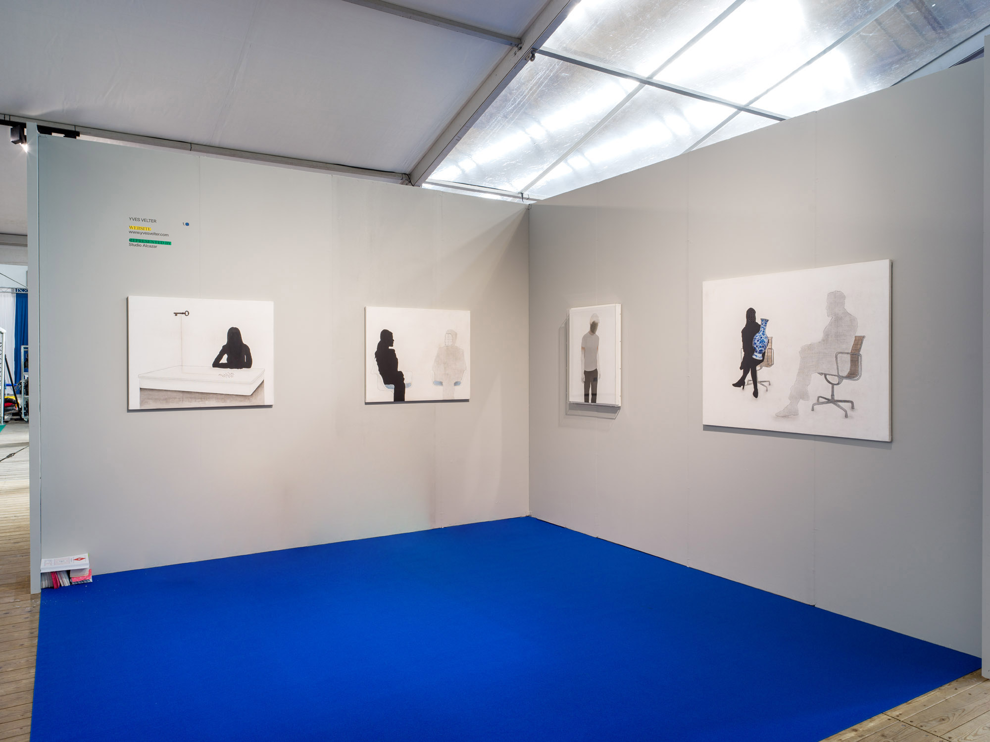
In earlier texts with regard to visual artist Yves Velter, the word ‘serendipity’ has already been used a few times: finding by accident something that you are not actually looking for, but that you nevertheless can and want to take further along. In my view this is only partly true: Yves Velter leaves few things to chance. That which he (re)searches, he (re)searches thoroughly. And while in the beginning of his oeuvre he was preponderantly looking for ‘the physical’, his work soon evolved towards the peeling off of the psyche of that bizarre creature, the human being, that differs from, say, a chimpanzee in merely one percent of genetic material, but that within that tiny bit ‘more’ (or is it ‘less’?) realizes a world of difference in the capability of abstraction, thinking proactively, psychologising, growing demented and plenty of other things that grace as well as plague the human race.

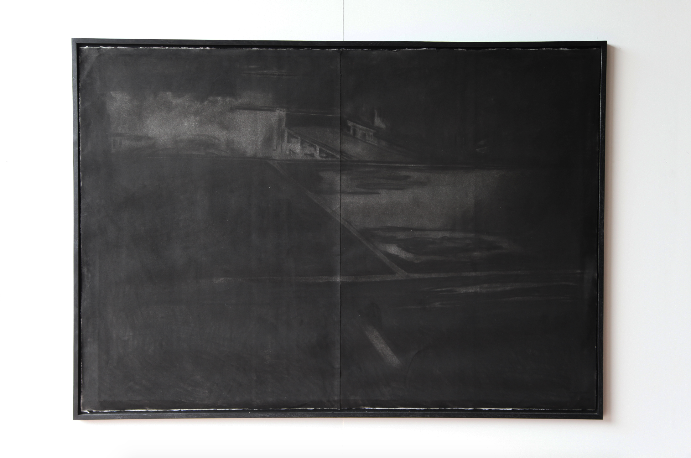
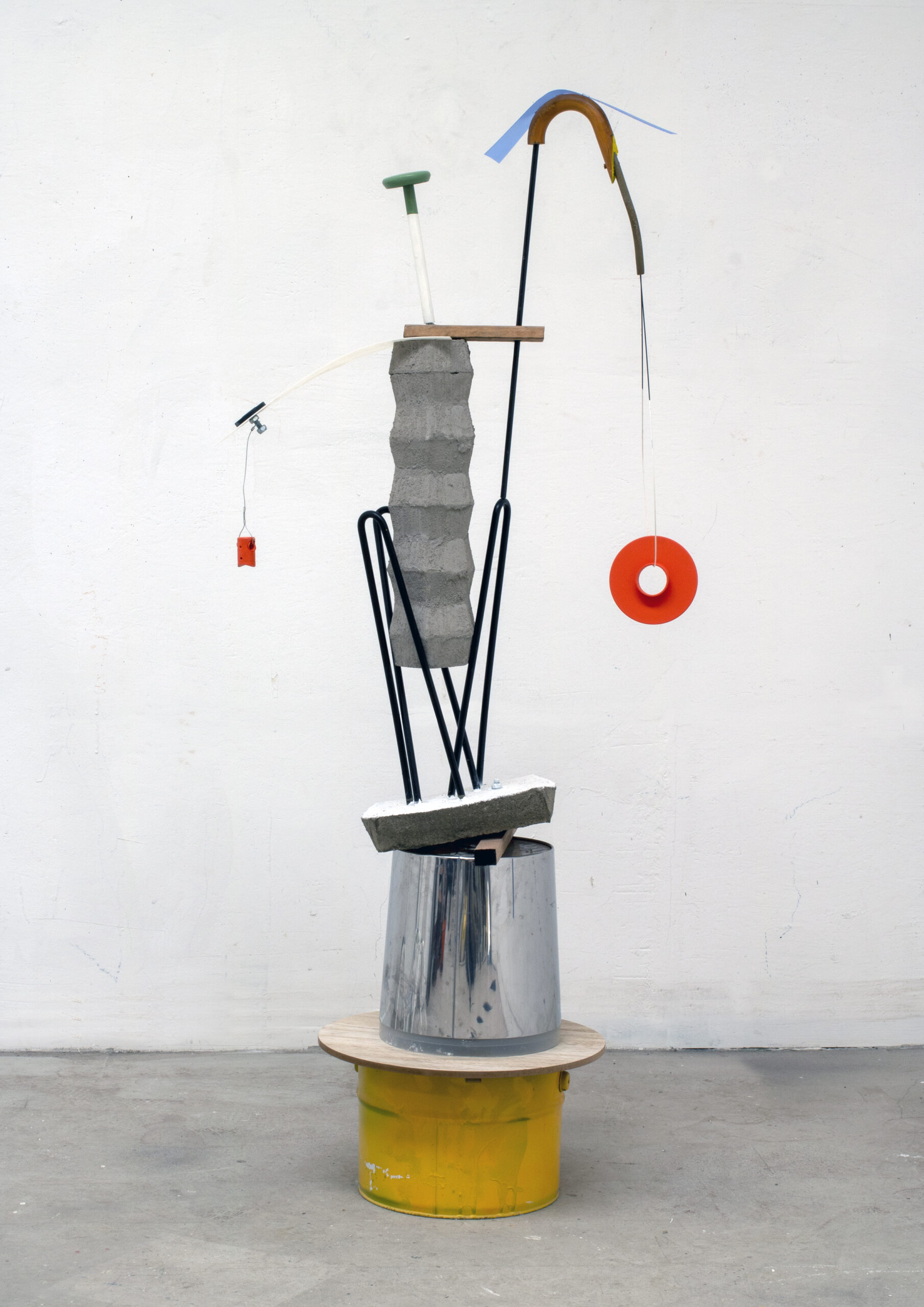
In the early 1990’s Yves Velter, as an autodidact, investigated form. At first in a rather graphical manner: colour, matter, form, dimension, which lead to a ‘technical’ way of drawing; later he moved towards working in a more content-oriented way and in different dimensions. Thus he took existing forms apart (e.g. a chair), in order to have this one ‘form’ breaking up into other forms, always in search of that one, ideal, pure end point. Or he brought forms together in order to mould them into a new whole. In different ways Velter looked for expressive solutions that could provide an answer to his questions. But an ideal form does not and will never exist.

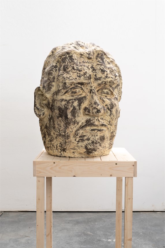
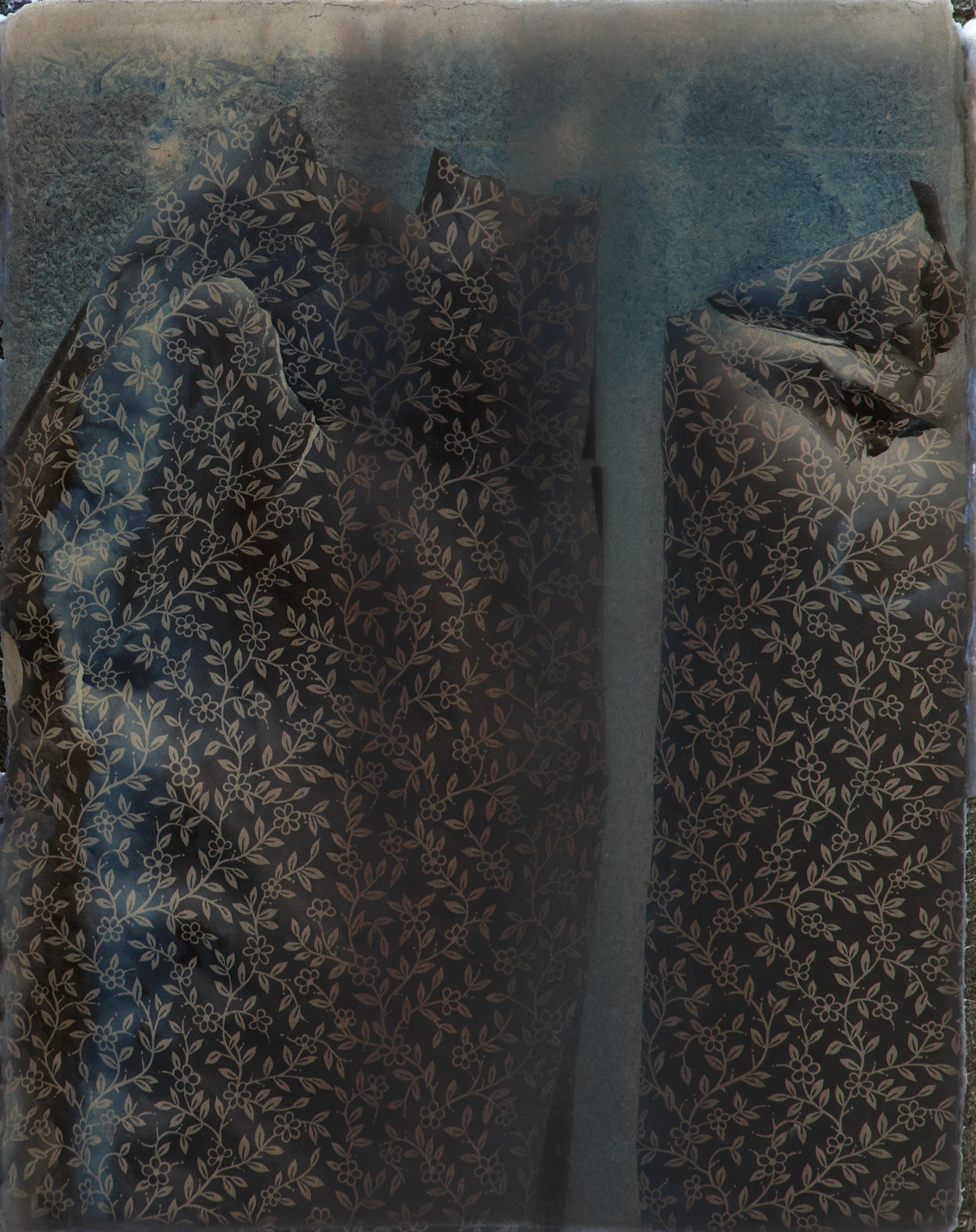
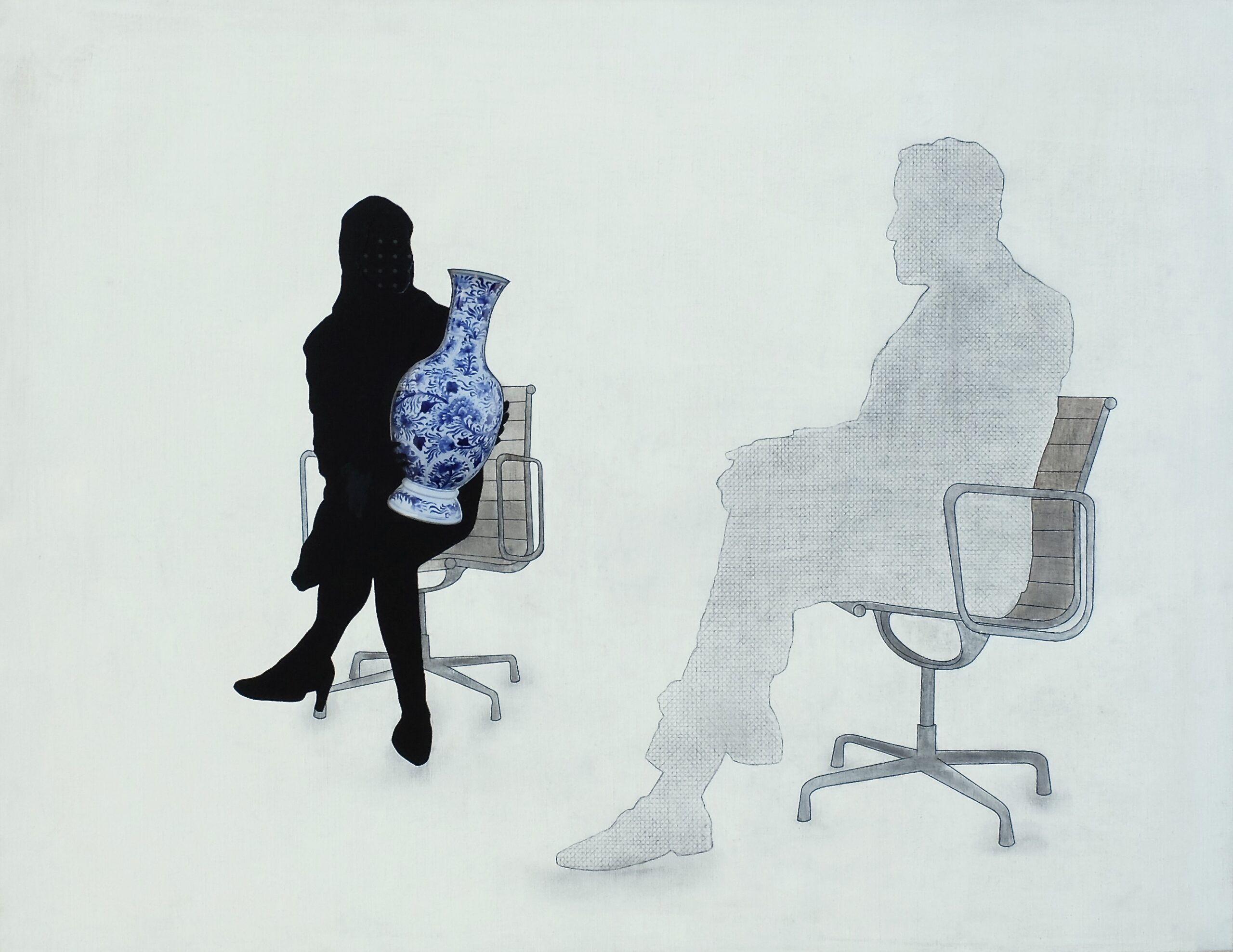
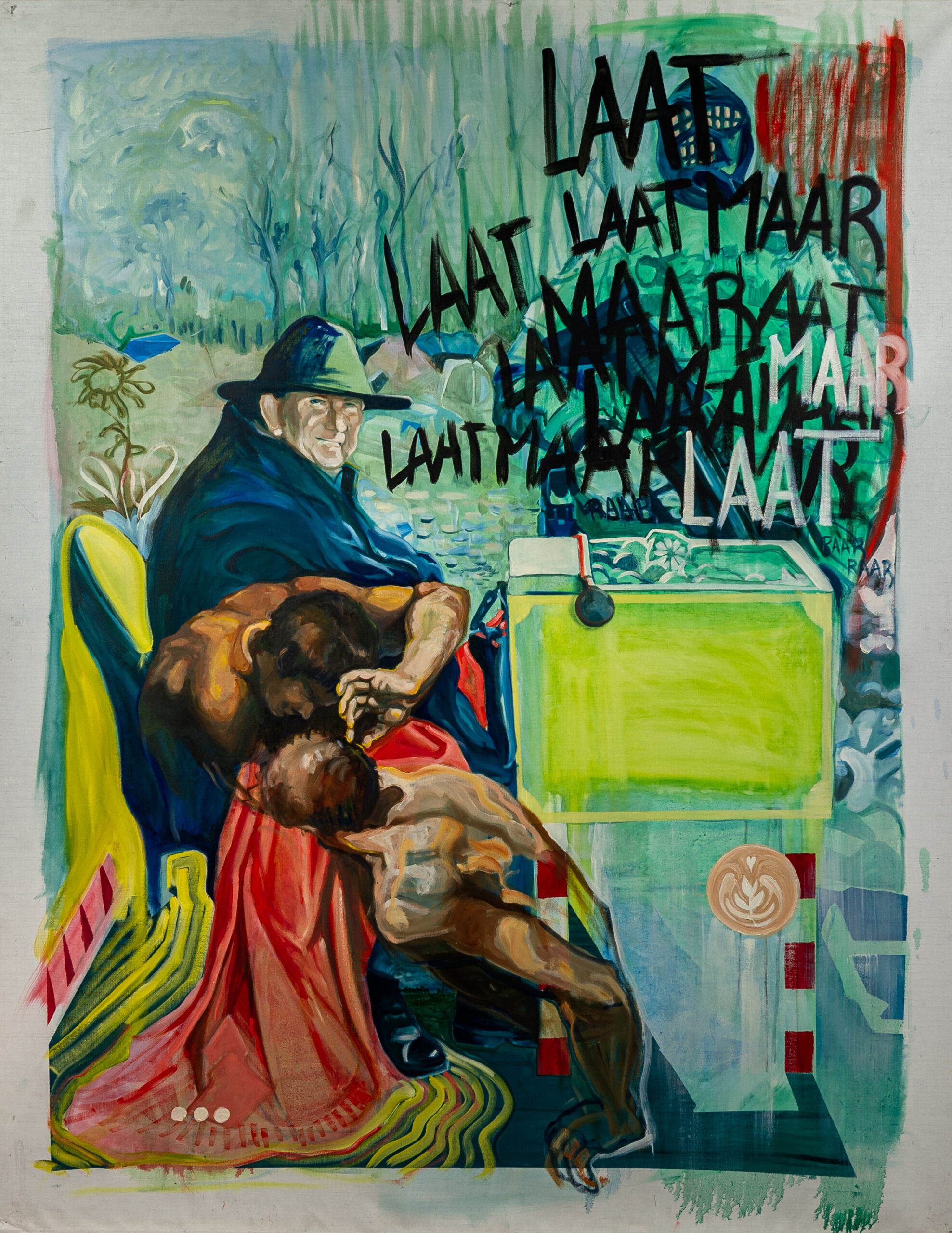
If something about the epithet ‘serendipity’ is true in relation to Velter’s way of working, it is that in the course of his exploration he accidentally came across the phenomenon of ‘man’. Pure form made way for the complicated form of ‘the human being’. And the question shifted from “What is form?” to “What is identity?”. Velter explores the human being (the other, but also himself), his psyche, his perception. They look like familiar figures, and yet they cannot be placed. They are given little context, not much background, no indication of place and time: this is about man in a critical situation. Their outlook is coded: their eyes contain pieces of text from letters written by an autistic aunt of his. Unreadable, incomprehensible texts for everyone but herself, since she used them to devise her own code language.

This is also what an artist like Yves Velter does: he has created his own code, which we can understand in the way we determine ourselves. Can you convey a certain message through colour, for example? The trigger will be different for the artist as compared to the viewer. We can only know each other in a limited way, we are continually modifying our self-image and the image of the other, chance and doubt will always reign.

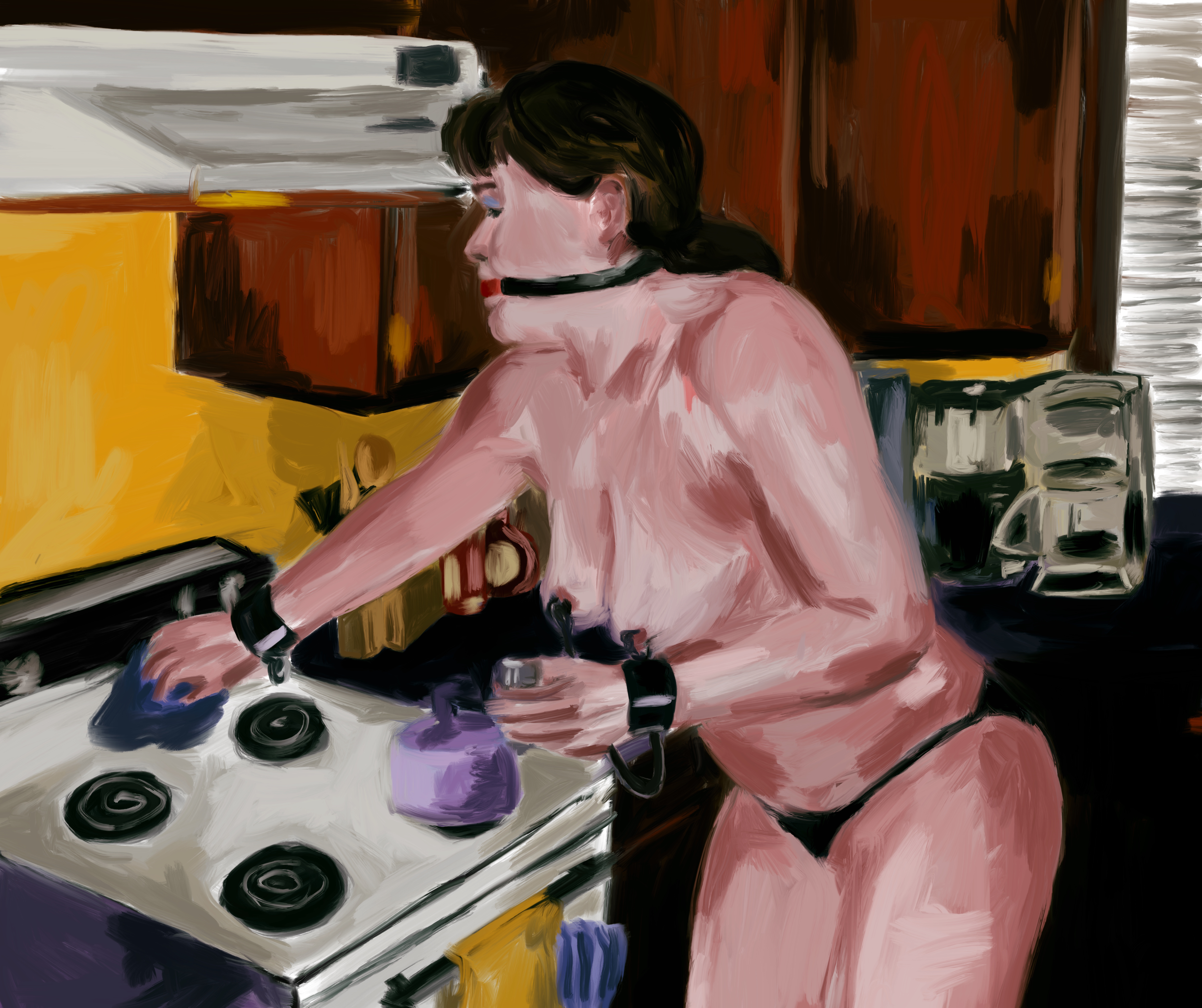
And so you see how Velter’s figures are involved in self-investigation, by stripping themselves of a slice of skin from their arm: under the skin a piece of unreadable text is found. Or you see figures that are vomiting gold, because they have too much materiality inside; or the ones who vomit ink, who are letting go of the matter they are drawn in; or, more recently, the naked woman with the intestines she is pushing out.

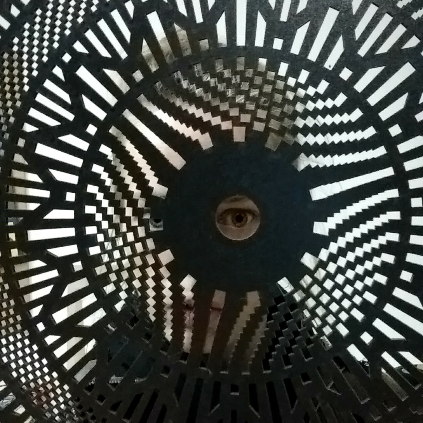
Images, events whirl out into small spots and little balls, as forms of memory loss. The faces of certain figures turn out to be mirrors, so that they look back at you yourself. A man has four eyes: is he sleeping or looking? And whatever he is doing, can you, the viewer, get a grip on it? Not in the least, for the artist has not got a hold over it either: he actually even does not want to, he searches, presents questions, keeps his distance. Velter’s oeuvre is all about questions that refuse answers, about fears that mask desires, about talking without communicating, about the expressive power of the unreadable. Along with all that, a characteristic crops up that typifies the whole of Velter’s work: the feeling of unease. Not a cheerful oeuvre, no spectacle, but work that slides the unease into the viewer’s brain, by showing what we all do indeed feel, but do not want to know.

Marc RUYTERS

yvesvelter.com

Reversing the talk act IV

Reversing the talk Act VII

Surfacing hesitation phase I

Vrijland act II

READ MORE

Valcke Art Gallery

GALLERY
go back

Valcke Art Gallery

Valcke Art Gallery

Valcke  Art Gallery takes part in the Belgian Art & Design Fair and presents three artists working with clay. Their sculptures cross the borders of cliché ceramics,  the obvious bowls , cups, pots and all kind of figurines. It is our view, perhaps our commitment, to bring their tangible art to the public. Ceramics go way back , ten thousands of years ago, used by the emerging human race, but still are part of our lives,  our imagination, our contemporary culture. Annouk Thys, Sofi Van Saltbommel and Reinhilde Van Grieken create objects that carry the ideas and vision of their maker, the artist.

Annouk Thys (B) works with materials as glaze and porcelain. During her study at LUCA School of Art Ghent (BE) she knew that experimenting was important to her, bringing together different materials—both ceramic and others—to investigate how they interact. An interaction that initially arises as “self-forming.” Different layers of materials are brought together and each material finds its way. This process of transformation is a way of finding new possibilities through and within a material. Heat, gravity, time and space have an influence. This interplay of experiment, creation and luck—making processes tangible and showing what usually remains invisible—is what challenges her. It is the driver of her work and results in new forms or  installations as she made for SMAK (Gent 2010) and The Biennale of Moscow ( 2011). Her time in the EKWC (Nl), a residency in 2013, was an opportunity to research the possibility of glaze as a sculptural medium. It was a run-up to create the ‘wanderfalls’. They where shown at the 5th European Triennial of Ceramics and Glass (Mons 2017) and rewarded with the price of the public. She continues to use glaze and porcelain as her basic materials. An elliptical and fascinating universe emerges through their mysterious poetry. Notions of the landscape, time and elements of nature appear repeatedly in her work.

Sofi Van Saltbommel (B) studied sculpture at the Royal Academy School of Arts in Ghent (1996) and the Academy for Fine Arts in Brussels. She is a versatile artist working with multiple techniques, but with a profound love for ceramics. The courses of ceramicist Thérèse Lebrun in Ixelles reinforced this feeling. The sculptural ideas of Pierre Caille, founder of the first ceramic art workshop in La Cambre in Brussels and in a way godfather of Belgium’s ceramic art scene is still present. Mixing materials is one of the characteristics of her work, together with the transformation of banal objects into objects carrying new values. Those transformations refer to the human body, the painful changes of the body in its real or fantasized hybridations (free after Ludovic Recchia, catalogue Keramis, 2019). It results in both sensual, sexual and disturbing sculptures. Next to her statues Sofi tackles the decorative arts by creating bowls, in a rather intuitive way, letting the glaze crackle and adding resemblances of fruits and vegetables. In these works she pushes the boundaries of the normal perception of a bowl or utensil and places them in her own world of fantasy and form. Her work is mostly shown in Brussels, Wallonia and France, with a major exhibition held in 2019 in Keramis, La Louvière. Valcke Art Gallery is proud to present her work in Flanders. One can admire her work in “Visions” a temporary exhibition (until 2 January) in the  Musée International du carnaval et du masque (Binche).

Reinhilde Van Grieken (B) studied sculpture and ceramics and started her career twenty years ago as ceramicist. She broke through on the international scene early 21st century. From 2006 on until today her work is continuously selected in international exhibitions and biennials as e.g. Vallauris (F), Zaragoza (Sp), Mons (B), Höhr-Grenzhausen (D), Andenne (B), München (D) etc…  She took part in the prestigious international biennial “Fragility/Monumentality” organized be Becraft in Mons and in the National Design & Craft Gallery in Kilkenny, Ireland. Most of her work is in stoneware, composed of hand turned elements, put together to suggest motion. In those works Reinhilde takes the challenge to walk the thin line between art, crafts and design. Very intriguing work is about the abuse of children by religious people. As a matter of fact it is her way to express her proper experiences as a child. It works therapeutically. The cylindrical ceramics are partially covered with transfers ( ceramic photo’s) of religious scenes, partially glazed in one colour. She often abundantly uses gold lusters which suggest the glamour and pomp of the church. The objects resemble fallen chalices. As spectator one should not just have a glimpse of the work, or let the eye be distracted by the gold and the images. One should take the time to look thoroughly at the work and try to sense the meaning of it. To concretize her story she uses different techniques to enhance the value of form, color  and composition. In a subtle way actuality, societal on acceptable events are transformed into three dimensions. Sometimes painful and cruel, sometimes funny and humoristic. Interaction with the public is very important . Clay is in a way used as a canvas as a painter does. Another time she creates monochrome sculptures. Work is getting abstract and suddenly shadow becomes an essential element. Its is poetry in 3D.

valcke-artgallery.be

Annouk Thys: 1 Glaze experiment #5

Reinhilde Van Grieken: Punition F: Dirk Theys

Sofi Van Saltbommel: Rocher-rose

READ MORE

Robin Bollschweiler

ARTIST
go back

Robin Bollschweiler

Robin Bollschweiler

The object is a chess board that can be folded into a column to be stored. It also acts as a box that contains the pieces. The boards are made in Zürich, Switzerland from waste of Linoleum from different industries. The marble imprints on it emphasize the expression of the classical column. The size of the finished object is chosen according to the «chessmen» found in second hand shops giving them a height between10 cm and 40 cm. The closing system is inspired by a pepper mill, holding everything in place making the smallest version easy to carry around.

Robin Bollschweiler is a young swiss architect who studied at ETH Zürich. His interests lay on how things are build and in the details. His work focuses mostly on the small scale architecture and the making of objects and furnitures. He enjoys building prototypes himself. His pieces are made between Lausanne and Zürich, in Switzerland.

READ MORE

Allegrarte

GALLERY KUNST AAN ZET
go back

Allegrarte

Allegrarte

allegrarte.com supports emerging talented artists, mainly from Belgium, by providing a professional “state of the art” e-commerce platform to promote their art to the broad public. The website only presents artists and works of high quality, selected by a college of experts in contemporary art. This choice was made consciously in order to guarantee the buyers the authenticity of the offered works of art. In addition, Allegrarte, together with a number of professional partners (Mac’s, editions Bruno Robbe) offers a high-quality selection of “limited editions” in limited editions.

The user-friendly online platform makes it possible for every art lover to find his or her favorite work of art by using an extensive search function. allegrarte.com also shows art offline through the organization of events dedicated to recent evolutions in contemporary art, such as in 2018 where a virtual work of art was presented to the public conceived by the artist Alice Janne.

allegrarte.com

ARNAUD GERNIERS: 45°06’25″N – 1°08’20″W

ARNAUD GERNIERS: 52°-59-52NN-4°-44-2E

Trui Demarcke: Illumination V

Trui Demarcke: TT27

Yuri Andries: Ato and Malai in Julia's bedroom

READ MORE

BAMM! - Curating The Young

GALLERY KUNST AAN ZET
go back

BAMM! - Curating The Young

BAMM! - Curating The Young

We require space in the cultural sector for fresh talent by giving beginning artists a stage. The team is responsible for all related matters: scouting artists, setting up the exhibition, communication on social media, public mediation and sales. Everything is in the hands of young people.

Empowering young artists is not only giving them a stage, but also giving them financial opportunities. Looking for artsy gadgets or original artwork by young artists? You will find that with us too! Then you not only support our youth work, but especially young artists.

curatingtheyoung.be

Manon Clement: To capture you

Manon Clement: If I could give you a place

Manon Clement: Written words release your impermanence, I release your tangible words I

READ MORE

Barbé Urbain

GALLERY KUNST AAN ZET
go back

Barbé Urbain

Barbé Urbain

BARBÉ URBAIN gallery focuses on curated exhibitions built with emerging and more established contemporary artists in various domains. The gallery is located in Ghent, Belgium.

READ MORE

Bruthausgallery

GALLERY KUNST AAN ZET
go back

Bruthausgallery

Bruthausgallery

According to the philosophy of Bruthausgallery, contemporary art should transcend the boundaries of the art world and refer to social themes. The gallery, located in Waregem, organizes an average of five exhibitions a year and mainly focuses on solo exhibitions. In doing so, Bruthausgallery pays a lot of attention to the art-historical context and the vision of both the artist and the curator.

In 2016, four years after the gallery was founded, Bruthausgallery provided the building with an additional exhibition space. This expansion makes it possible to offer a double program in which more attention can be paid to group exhibitions and larger works.

READ MORE

CAPS contemporary art projects

GALLERY KUNST AAN ZET
go back

CAPS contemporary art projects

CAPS contemporary art projects

CAPS (Contemporary Art Projects) is a nomadic contemporary art gallery that arose after the closure of CypresGalerie (Leuven ). Since 2013, CAPS has focused on contemporary art with a particular focus on painting and works on paper by Belgian artists, representing emerging talent as well as mid-career artists and éminence grises.

CAPS does not have a permanentCAPS brick-and-mortar space, but as a nomadic initiative,regularly sets up tents in various spaces in Flanders (Antwerp-Ostend) and Brussels and participates in art fairs at home and abroad

(Art on Paper – Art The Hague – Luxembourg Art Week).

c-aps.be

Chris Vanderschaeghe: Disturbed landscape

Edith Ronse: Rooting and listening

Yves Beaumont: Swelling sea

READ MORE

CAS Contemporary Art Space

GALLERY KUNST AAN ZET
go back

CAS Contemporary Art Space

CAS Contemporary Art Space

CAS (Contemporary Art Space) works in two locations: in an eclectic mansion in the Belle Epoque district of Ostend and in a restored old space in Zottegem. Every year CAS organizes a number of events with a diversity of contemporary artworks, in which different disciplines are discussed. CAS also offers a platform to young, experimental artists.

cas-zo.be

Marc Galle: B-LAST

Marc Galle: American Dream

Anne Vanoutryve: Dystopia

READ MORE

Galerie Dessers

GALLERY KUNST AAN ZET
go back

Galerie Dessers

Galerie Dessers

Galerie Dessers was founded in Hasselt over forty years ago. In 2019, the surface was more than doubled, connecting two streets. A passageway to the future, 60 meters long, right in the center, with contemporary art on the walls divided into five distinctive exhibition sets. With an area of ​​530m2, the gallery is conceived as a total art experience. Parallel to the solo exhibitions, there is room for guest artists and the most recent work by the gallery’s permanent artists.

galeriedessers.be

Franca Ravet: Traitres tropiques

Hanna Ilczyszyn: Rushes

Martine Thoelen: Drawing in the Sand

READ MORE

Gallery Ysebaert

GALLERY KUNST AAN ZET
go back

Gallery Ysebaert

Gallery Ysebaert

Gallery Ysebaert is an exclusive contemporary art gallery with a focus on paintings and sculptures. Every three months a new exhibition is presented, each time with a balanced mix between national and international artists. The exhibitions are thematically curated into one whole, but visitors can always view all works by our represented artists on request.

Due to the careful selections that are exhibited over an area of ​​300m2, all artworks get the space they deserve. The works are spread over our two exhibition halls and outside in our relaxing sculpture garden, which includes a collection of bronze and corten steel sculptures.

galleryysebaert.be

Alain Winance: Untitled

Frank Kenis: Hidden Treasures III

Hans Temmerman: Untitled

READ MORE

Husk Gallery

GALLERY KUNST AAN ZET
go back

Husk Gallery

Husk Gallery

Husk Gallery aspires from the Brussels region to promote new and strong ideas of artistic talent at home and abroad. Ingrid Van Hecke (art historian, KU Leuven) is the founder and gallery owner. She mainly focuses on painting and drawing, but does not exclude other artistic media. Husk Gallery creates exhibition projects with contemporary artists from a specific angle. The curated exhibitions are set up online, in our own gallery space in the Brussels Rivoli building, as well as in extra muros. The gallery strives for a balanced representation of male and female artists, as well as a mix of Belgian and international artists. Husk Gallery is also a publisher of art publications.

huskgallery.com

George De Decker: The forsaken Cry XIIII

George De Decker: Denn das Schöne ist nichts als des Schrecklichen Anfang XI

George De Decker: Pli selon pli iii

READ MORE

Kristof De Clercq Gallery

GALLERY KUNST AAN ZET
go back

Kristof De Clercq Gallery

Kristof De Clercq Gallery

Kristof De Clercq gallery opened its doors in 2012 a stone’s throw from the historic heart of Ghent. The contemporary art gallery shows and promotes the work of Belgian and international artists and aims to strengthen the dialogue between different generations. The exhibition space, located in a green oasis of tranquility, hosts five solo and group exhibitions every year.

kristofdeclercq.com

Johan De Wit: Untitled

Peter Morrens: 8x lachen

Veerle Beckers: Peaches

READ MORE

Galerie La Forest Divonne

GALLERY KUNST AAN ZET
go back

Galerie La Forest Divonne

Galerie La Forest Divonne

Galerie La Forest Divonne has its origin in Paris and was founded in 1988 by Marie-Hélène de La Forest Divonne. In 2016, a second gallery space opened in Brussels, led by her son Jean de Malherbe. Although each gallery owner draws up his own exhibition program with international artists, quality and timelessness remain the most important criteria for showing various media such as painting, photography and installation. The gallery combines French art from the 1960s and 1970s with the work of emerging and mid-career artists from Belgium.

galerielaforestdivonne.com

Catherine François: Boomerang

Jeff Kowatch: World Transcender

Tinka Pittoors: Usurpator Poiiing

READ MORE

Schönfeld Gallery

GALLERY KUNST AAN ZET
go back

Schönfeld Gallery

Schönfeld Gallery

Schönfeld Gallery shows work by both established values ​​and young talent from Belgium and abroad. Spread over a number of rooms at different locations, different atmospheres and accents are explored.

Schönfeld Projects in Antwerp is primarily a workspace for artists in the run-up to an exhibition. This space is open to the public and functions as a meeting place for artists and art enthusiasts.

The gallery and Art Bar in Rivoli Brussels follows the exhibitions to the rhythm of the surrounding galleries. Group exhibitions or collaborations with young curators provide space for new artists.

Schönfeld C recently opened a space that differs greatly in style and atmosphere from the Rivoli and is more suitable for solo exhibitions.

Schönfeld Gallery participates in trade fairs in Belgium and abroad.

READ MORE

Stieglitz 19

GALLERY KUNST AAN ZET
go back

Stieglitz 19

Stieglitz 19

Stieglitz19 was founded in 2008 by Dries Roelens as a gallery specialized in contemporary photography, with a strong international focus. For more than 10 years he has been showing artists who have challenged contemporary photography with multidisciplinary work and innovative techniques. Since its inception, an entire generation of Chinese, Japanese, American and European artists has shown their work in Europe for the first time in the gallery. The gallery is located in the historic center of Antwerp and shows a sample of contemporary photography with 5 exhibitions per year and occupies a unique position in Belgium through its programming.

READ MORE

Valcke Art Gallery

GALLERY KUNST AAN ZET
go back

Valcke Art Gallery

Valcke Art Gallery

Valcke Art Gallery shows tangible three-dimensional objects, in traditional and new materials. Technique and imagination, humor and fantasy, profound emotion, top craftsmanship and unconscious knowledge generate moving objects for the eye and mind. They are objects that make the artist’s vision tangible in our virtual world.

Valcke Art Gallery presents innovative work by top Belgian and foreign artists/makers in the fields of ceramics, glass (crystal) and silver. The gallery is one of the rare stages in Belgium for art on the borderline between function and non-function, between design, craft and visual arts.

READ MORE

Lou van ’t Riet

ARTIST
go back

Lou van ’t Riet

Lou van ’t Riet

Elegant and minimal; Lou van ‘t Riet redefines the triptych.

Lou van ’t Riet grew up in Brussels where she studied design and architecture at the CAD (College of Art & Design) before leaving for her MFA at the  SVA (School of Visual Arts) in New York. Seduced by the city she will carry on living there until 2017; working for the Chamber Gallery and for the multidisciplinary artist Katie Stout.

These years allowed her to explore and enrich her network of artistic references through exhibitions, discussions with artist and art professionals. Through her work at the gallery, her personal wandering in museums, she started to observe closely the viewers attitude toward the exhibited works of art. She was struck by the distance that was existing between the viewer and the work. ‘Stand back’, ‘do not touch’ are amongst the injunctions that keep the viewer at that distance, preventing him to engage in what the artist sees as an essential connection with the work.

Through her creations Lou aims to fill this growing distance between the viewer and the work and break the ‘do not touch’ rule. Her idea is to create a different approach to art where the viewer is summoned to engage and even interfere physically with the work – forcing him to go beyond the traditional rules of an institution.

With that intention Lou created her triptychs. Wall sculptures where the viewer is invited to become an active part of the work by manipulating it. These triptychs – made out of metal – are organized in three articulated panels, each of different shapes and colors that create different visual compositions each time they are activated. By opening or closing a side the viewer will choose his variant in the geometrical and visual configuration. May the triptychs be closed, completely or partially opened; they are an invitation to contemplation.

Written by Astrid Malingreau

READ MORE

Kobe De Peuter

ARTIST
go back

Kobe De Peuter

Kobe De Peuter

People sometimes dare to claim that Kobe De Peuter is a misanthrope. He, who crawls into his studio in Spain to spend months on end hardly hearing a thing and sometimes for weeks on end forgets to charge his smartphone. When he’s not painting, he has his nose in books (he processes about 100 a year!), but one doesn’t have to press him for long to get him to talk.

His vision is kaleidoscopic. His studies are like the assembly of a constellation in which countless connections can be made, to compare or contrast with each other. An individualised mythology based on a collection of knowledge, so to speak. There is no other way, according to the artist.
After all, each individual is merely the sum of environmental factors. An identity consists of a plurality of players, all with their own interests. There is no central self. Free Will is an illusion and a dogma for people who must believe their own narrative in order to give their lives meaning and significance. That meaning and significance are imaginary, as is the sense of control they can bestow.

We construct illusory images of man and the world. The visual language of public space, including the online world, reflects our collectively conceived self-portrait. The individual presents himself on this stage with an avatar: also a fantasy image. “Secretly we no longer wish to be human, but the abstracted demigods we create with our culture,” says the artist: “Our wishing image can only survive through reciprocity, a mutual affirmation of each other’s avatars from a collective desire to conceive of the self-image as real.”
With the tools of today’s attention economy, we succeed in doing so better than ever before. Nuance and content disappear and identity becomes increasingly delicate under a perfecting avatar.

“Everything becomes a show,” he says: “Society, online and offline, like a Christmas tree. If you want to celebrate, you have to bring a present. That gift is your identity, value or contribution. The gifts that suggest the most spectacular content attract the most attention. Cliques form around the guests with the most startling gifts…. But hardly any of the packages contain what the packaging suggests! So each clique ends up preaching a cult about the promises in their pile of presents, while accusing others of spoiling the party with their fake presents”.
I ask what this has to do with his work. He raises one eyebrow, an ironic imitation of astonishment. “The oeuvre, the value and the artist are the trinity of the contemporary art cult. I’d hate to live up to expectations and send you back home with just some gift wrap. How much time do you have?”

No, he is not misanthropic at all. Stoic rather, perhaps epicurean. Kobe De Peuter goes to great lengths to ward off the emptiness and in doing so goes in search of the unconscious references to the transcendent in the visual language of our contemporary society. He is a parcel-picker, classifying what he can find in order to distil his images from it, as it were. But all the time he remains aware of the futility of his efforts. Yet, “Il faut imaginer Sisyphe heureux,” and his work bears this out.

Lucy T. Emergo
Barcelona, 09-2021

kobedepeuter.com

Flowery Fast Forward

Sintels

Una Selva Oscura

READ MORE

Arnaud Eubelen

ARTIST
go back

Arnaud Eubelen

Arnaud Eubelen

Arnaud Eubelen – Liège, Belgium, 1991 – works in the no-man’s land between sculpture and design, questioning our assumptions leading from concepts to objects and the measure to which construction material are taken for granted, re-appropriating and re-valuing the various industrial building-stones of our world by shifting their use and context to highlight the intrinsic qualities and values. By sensibly re-wiring and re-writing the urban context that surrounds us through different material layers with their own narratives and lives, he views the streets of our man-made world we live in as hardware stores or a ‘matériotheque’ as he puts it. Through the realization of supposedly day to day objects of use with his distinctively different approach, deliberately disrespecting the established codes towards materials and their intended use, his practice leads to a body of works pertaining to the world of design but build from repurposed industrial redundancies, creating unique objects with particular identities bridging gaps between art and luxury to the industrialized world.

READ MORE

Berserk Art Agency

GALLERY
go back

Berserk Art Agency

Berserk Art Agency
Berserk Art Agency was established in 2014 by Anouk Focquier as a 360° platform to support the arts and artists.
Berserk Art Agency aims to present and nurture qualitative, timeless art practices deeply rooted in artistic traditions and history, connect artists to (inter)national artistic networks and collections, present their work and support the next step in their oeuvre with a long term vision.
Berserk Art Agency represents artists, is an independent curator and art advisor for art integration/projects and an arts manager for artistic organisations. Berserk Art Agency has no permanent presentation space and works nomadically within an international context.
Art lovers and collectors are invited to see the works in exhibitions, art fairs and are welcome for studio visits.
berserk.be

Kristof Van Heeschvelde: The Abduction of The Last Supper © Jonas Verhulst

Kristof Van Heeschvelde: Wanuweer © Jonas Verhulst

Atelier Ief Spincemaille: Rope 6m

Atelier Ief Spincemaille: Rope 6m

Atelier Ief Spincemaille: Rope 6m

Kristof Van Heeschvelde: nfluencers in the Wild © Jonas Verhulst

READ MORE

Pieterjan

ARTIST
go back

Pieterjan

Pieterjan

“Round Table”

This round table is a derivative from an earlier extendable table, custom-made by De Coene, specially designed for an interior project in a medieval building.
The shape of the legs is based on historical Flemish tables with a ground-trestle.
This new variant, a round table, is made for smaller spaces but maintains the same shapes, referring to historical furniture.

pieterjan.biz

©Tim Van de Velde

©Tim Van de Velde

READ MORE

Atelier Ecru

GALLERY
go back

Atelier Ecru

Atelier Ecru
GROUP SHOW with works by: Bram Vanderbeke, Charlotte Jonckheer, Gert Van Dessel, Jojo Corväiá, Jumandie Seys, Katrien Doms, Maria Scarpulla, Middernacht&Alexander, Nathalie Van der Massen, Pierre De Valck, Tim Vranken
We are a gallery for contemporary, brutalist & modern design, art and furniture. We offer atypical designs, curated and collected in our interior planning studio.
We welcome our visitors, collectors, architects, designers and artists, to a place that caters to their specific needs.
We are Stéphanie Frederickx, with a background in Belgian fashion and in shoemaking, and Christophe Urbain, the other half in work and life, curator, and co-director at Barbé Urbain gallery.
weareatelierecru.com

Bram Vanderbeke

Bram Vanderbeke

Bram Vanderbeke

Bram Vanderbeke

Charlotte Jonckheer

Charlotte Jonckheer

Gert Van Dessel

Jojo Corväiá

Jojo Corväiá

Jumandie Seys

Katrien Doms

Katrien Doms

Katrien Doms

Middernacht&Alexander

Middernacht&Alexander

Middernacht&Alexander

Middernacht&Alexander

Pierre De Valck

Pierre De Valck

Pierre De Valck

READ MORE

Francis Bekaert

ARTIST
go back

Francis Bekaert

Francis Bekaert

Painting is the core element of my artistic path. What I’m after are the tactility and the multiple layers of paint on canvas. The emphasis here is not purely on the material or on the representation of figuration. My starting point is the quest, the interaction between the layers of paint, between the material and the representation, between reason and emotion. This fascinates me more than producing a finished outcome. Sometimes the process is rather labour-intensive, sometimes more contemplative. My painting process is a succession of choices and reworkings that lead to a thoughtful, but also intuitive work. Its basis is not a specific space, but the representation of a certain mood. Sometimes vegetal or landscape motifs can be found in the paintings. Human life, the individual and the landscape are inextricably linked. But my paintings are no transparent, unambiguous representation of the observable. They propose fading, distorted images, in which the pictorial components themselves play an important role: paint, brushwork, form, depth, … until each work claims its autonomy.

READ MORE

Bram Vanderbeke

ARTIST
go back

Bram Vanderbeke

Bram Vanderbeke

Casted Models
Regular bricks are arranged into both methodical and intuitive compositions on the floor of the working space. In doing so, Bram Vanderbeke creates negative spaces, which are then used as unique moulds for the creation of (abstract and) architectural sculptures.
The resulting Casted Models repeat the rhythm and texture of the brick moulds, including the stones’ raw and grainy surfaces. The prominent seams echo the liberty of the method and introduce a primitivistic aesthetic. The Casted Models are a series of smaller unique casted objects that one day might be translated into bigger architectural objects.

Pictures by Pim Top

READ MORE

Chloe Arrouy

ARTIST
go back

Chloe Arrouy

Chloe Arrouy

Chloé Arrouy’s practice of objects sculpting pushes her to explore the empathetic power of forms in their capacity to induce, with their mere view, a physical sensation, a torment. The universe she invokes resonates with those of middle-age, witchcraft or art deco. All those territories provide her with ways to evoke, sometimes with a satyrical touch, her relation to life and culture. In their rapport to craftsmanship and ornamented, rustic artefacts, her objects bear references to medieval societies, their skills, and their proliferation of troubling forms. Beyond the transformation and the reappropriation of symbols, she also identify at the heart of her practice, dynamics of revalorisation, the materials that she uses being mainly derived from the recovery, sometimes directly from obsolete domestic objects. Her practice is also based on an experimental approach to craft techniques, sometimes traditional, related to the shaping of metal (casting, welding, ornamental ironwork …).

READ MORE

Lerry Ceramics

ARTIST
go back

Lerry Ceramics

Lerry Ceramics

LERRY ceramics was created in 2020 by Elke Vanlerberghe (°1975), who lives and works in Ghent, Belgium. All pottery is handmade and fired in the backyard studio. Each piece is unique and is a result of a playful exploration with clay, decorations and glaze. The more these ceramics make you smile, the more they have accomplished their mission.

All LERRY ceramics are handbuilt or wheel thrown with stoneware clay. Finished with underglaze and transparent glaze on top or with a mix of coloured glazes. All stoneware mugs, cups, plates, spoons and bowls are food safe and dishwasher safe, although preferably hand washed. The decorative pieces, wall hangers and candle holders are not food safe. Please keep in mind that each piece is not a standard industrial product. Due to the nature of handmade ceramics each piece has charming irregularities.

READ MORE

Louise Daneels

ARTIST
go back

Louise Daneels

Louise Daneels

The ‘DANNY’ series is a family of wheel thrown vases, hand built sculptures and glass-blown shapes. Each vase has its own character and can be placed in different installations depending on the space. The different settings make it look like they are posing for a family portrait. The identity of the characters take on a personality through their expressive colors and shapes. While some look more elegant, with refined and smooth surfaces, others are more clumsy in a shiny and kinky way. The characters are accompanied by abstract semicircles, thin welded frames and sculpted rocks. Handle with care.

READ MORE

Silver Linings x Tramaine de Senna

ARTIST
go back

Silver Linings x Tramaine de Senna

Silver Linings x Tramaine de Senna

femke@silverlinings.be

Tramaine de Senna’s first collection of artist jewelry ‘Love and Lacquer’ is an ode to the transcultural view. When the American de Senna saw the well-known chocolate seafood in Belgium, she became fascinated by their shape and the reason for their existence. “De Senna’s work bears witness to the artist’s intense relationship with materials and the migration of forms between different popular or material cultures, excess, and also the symbolic violence and ‘hauntology’ of different histories, both transcultural and personal”, the M HKA describes her solo exhibition in 2020, “In appropriating different forms, surface qualities and palettes, these works adopt a position of reflection towards society’s ability to produce prosaic pop culture in conjunction with its cannibalism of symbols and human subjectivities”. In ‘Love and Lacquer’, de Senna applies her typical visual, sculptural language without compromise, resulting in a beautiful collection of 32 unique objects. The cheerful colors and shapes refer with an insidious optimism to Pop Art and the tradition of artist jewelry from the 1960s and 1970s. The jewels are handmade, lacquered with refined motifs and color nuances and signed by the artist. They were finished with 24K gold leaf and 14K gold haberdashery by the team of Silver Linings. In addition to crystals, each jewel contains one diamond. Silver Linings uses ‘broken diamonds’, which are recovered from old pieces or were damaged during the grinding process and, not averse to poetry, perfectly match the artist’s love for symbolic textures and shapes. The elevation of an invisible, everyday praline into a jewel made of precious metal, the diamond and the salty theme provide a surrealistic and typically Belgian flair. Only the view from the outside can hit a culture so well.

Tramaine de Senna is an artist from California who lives presently in Antwerp. In 2015, de Senna became a laureate at the HISK (Higher Institute of Fine Arts) in Ghent. In 2013 she obtained an MFA at the Sint Joost Academy in Breda and ‘s-Hertogenbosch (NL); and in 2004 she graduated with two concurrent BA degrees in Architecture and Art from the University of California at Berkeley.

www.tramainedesenna.com

READ MORE

Thomas Renwart
BruthausGallery

GALLERY ARTIST
go back

Thomas Renwart

gallery: BruthausGallery
Thomas Renwart

It’s True
Ay, the pain it costs me
to love you as I love you!

For love of you, the air, it hurts,
and my heart,
and my hat, they hurt me.

Who would buy it from me,
this ribbon I am holding,
and this sadness of cotton,
white, for making hankerchiefs with?

Ay, the pain it costs me
to love you as I love you!
– Federico Garcia Lorca

For the Belgian Art & Design Fair 2021, textile artist Thomas Renwart (BE, b. 1995) has designed a handmade tablecloth and napkin in which words from the poem ‘It’s true’ by Spanish poet Federico Garcia Lorca are applied in red cross-stitch to a phantom image of a butterfly. The butterfly and the words form the place where only one person can eat and be present at a time. It is a reflection of solitude, the filling in of what is no more. But the person is assisted by a vague memory, transforming the solitude into an announcement of hope. A wish that the artist would like to pass on to whomever it may concern.

Thomas Renwart is represented by Bruthausgallery (BE, Waregem).

READ MORE

Tim Onderbeke & Maria Louisa Ponseele

ARTIST
go back

Tim Onderbeke & Maria Louisa Ponseele

Tim Onderbeke & Maria Louisa Ponseele

Artist Tim Onderbeke and jewelry designer Louisa Maria Ponseele bundle their fascination for memory, beauty, and luxury in the artist book ‘Spoons’. At the beach they created shiny eating utensils with found materials that they cast in tin. The result is a beautiful array of fragile, poetic objects with titles such as ‘Spoon for stealing rainbows’, ‘Post Poseidon’, ‘Tea for two’ and ‘Moule a gogo’. “The spoon is also the pre-eminent instrument that is used as an ornamental object, bought or donated: as a ritual gift at a baptism, as an expression of affection from a lover to his or her beloved or as a souvenir of a journey far or near”, writes Melanie Deboutte in the accompanying book. She begins her essay with Botticelli’s ‘Birth of Venus’, where we see this goddess carried ashore on a shell. “When the first spoon emerges exactly, is not known with certainty but somewhere between a hollow shell and an empty palm a scoop is created in the course of prehistoric times”, after which she takes the reader on a trip through art history using the spoon. ‘Spoons’ embraces the language of ‘minimal art’ that uses simple, abstract forms and the reference to mass production. But unlike the American artists from the 1960s, artist Tim Onderbeke transforms materials with a
charged history that bear the marks of their own affect. He examines the environment from which they were extracted and maintains a sensory link with the geographical context, the cultural associations and the human contact. The tin used for ‘Spoons’ was originally
intended to produce bullets and was extracted from beer taps.

Tim Onderbeke is a self-taught artist and has been active since 2002. His work focuses on
the intersection of spatial sculptures, paintings, photography, film, and graphics. His photos, videos, sculptures, and paintings are produced in a mechanical way and with minimal interventions he allows materials to speak for themselves.

More info: www.timonderbeke.com

‘Spoons’ is a collaboration with artist and goldsmith Louisa Maria Ponseele. Through
this project she became part of the Silver Linings team. She puts her technical knowledge,
skill and creative mind at the service of Silver Linings.

More info: www.louisamaria.com

READ MORE

Tom Volkaert

ARTIST
go back

Tom Volkaert

Tom Volkaert
READ MORE

019

ARTIST
go back

019

019

Reservoir: Wishing Well

In 2020, artist collective 019 turned it’s exhibition hall at Dok-Noord, Ghent—a former welding factory—into a swamp. This was a direct result of opening up the already leaking roof. A combination of natural and artificial precipitation, fed with water from the adjacent canal, led to a moist environment in which plants, animals, and water-resistant and -responding artworks thrived. The swamp became an evolving ecosystem, which is, as we speak, still changing in unforeseen ways. As part of the original exhibition, works by amongst others Helmut Smits (€URR€N€¥ €O¥N $TA€K$, 2018) and Agnieska Curant (Multiverse (minus one dollar), 2012) were on view. Those works tapped into the relation between water, currency, and economy. Inspired by those artworks in Reservoir, 019 created an installation which serves as an annex to Reservoir. It digs deeper into the relation between economy and water. 019 turns its presence at BADF into a scenography for a present-day wishing well, which creates the opportunity for a possibly beneficial investment of your currency.
Aim. Choose your words wisely.

READ MORE

Chloé Arrouy

ARTIST
go back

Chloé Arrouy

Chloé Arrouy

Chloé Arrouy’s practice of objects sculpting pushes her to explore the empathetic power of forms in their capacity to induce, with their mere view, a physical sensation, a torment. The universe she invokes resonates with those of middle-age, witchcraft or art deco. All those territories provide her with ways to evoke, sometimes with a satyrical touch, her relation to life and culture. In their rapport to craftsmanship and ornamented, rustic artefacts, her objects bear references to medieval societies, their skills, and their proliferation of troubling forms. Beyond the transformation and the reappropriation of symbols, she also identify at the heart of her practice, dynamics of revalorisation, the materials that she uses being mainly derived from the recovery, sometimes directly from obsolete domestic objects. Her practice is also based on an experimental approach to craft techniques, sometimes traditional, related to the shaping of metal (casting, welding, ornamental ironwork …).

READ MORE

Muller Van Severen - Design Museum Gent

ARTIST
go back

Muller Van Severen - Design Museum Gent

Muller Van Severen - Design Museum Gent

Design Museum Ghent will close in March for a long-awaited expansion and renovation. This will be celebrated with the very first major Muller Van Severen exhibition in their home town! The Ghent designer duo are celebrating their 10th anniversary and are closing the museum with a final refreshing look at the collection and their work.

Fien Muller and Hannes Van Severen have been working since 2011 on an inspiring oeuvre of furniture and objects based on their love of art, architecture and materials. They are one of the most image-defining designers of the moment.

 Together with you, the duo dives into the museum collection. They match collection pieces and their own work in a colourful installation on the ground floor of the museum. In the historical salons, they show their course by means of 10 key figures who helped determine their path.

designmuseumgent.be

©Frederik Vercruysse

READ MORE

Joachim Mares

ARTIST
go back

Joachim Mares

Joachim Mares

All images and objects originate from a simple: “Damn, that looks amazing.”
Joachim Mares tries to wield an honest and non-pompous way of creating objects. He is struck in awe by simple construction materials or day-to-day tools. His practice mostly starts out with an intention of duplicating things. In its essence the object of his fascination is presumed common and plain. But in the process of imitating the ordinary, he finds a certain esthetic. Raw materials like wood, steel, or concrete reveal a poetic character of the reproduction. There’s a childish game being played between function, esthetics and humor. One unable to be analyzed without the other.

This manual-labor-focused play is a way of understanding the object and the role it plays in daily life. Through making and struggling with its esthetic, it reveals a connotation or cultural significance that binds viewers with the object. There are certain things that respond with the viewer’s education, peers and surrounding. Mares’ work mostly tends towards a dialogue with Flemish architecture and its citizens. He feels a great aversion towards it, yet he cannot look away from architectural and untasteful sceneries.

Most pieces have a clear link to the environment where it is shown for the first time. The work is often custom made to fit a specific location, playing with the daily role it is supposed to have. The artwork originates from social encounters or contextual confrontations. Mostly there’s a fair amount of satire or a humorous wink to socio-political events that ignites the necessity of the object. Right then and there. Once it is exhibited, it has a participatory side. Most of the work you can touch, interact with, walk through or sit on. This creates an opening for a physical dialogue between viewer and object.

‘Nadarhek’ (2019)
This object aims to imitate the typical crush barrier. These fences have a mystical power; overnight they transform a quiet village into a well-structured maze and guide thousands of people to their destination during a local race, procession or festival… These things pop out, organize, stack and disappear in a fairylike way, only minutes after the event occurred.
A crush barrier is often a symbol of authority. Once the fence is set, people assume they cannot pass. The connotation of the object requires its spectator to walk around or to respect its function in a public space. The wooden duplicate tries to fool or surprise the participant. Can they pass? Can they touch the object? They might even want to throw it around? These questions are the start of tactile game.
The sculpture is made out of laminated wood. It’s very light and delicate, these features are in contrast with the original crush barrier. While these fences are mass produced and made to withstand crowds and heavy weather, the ‘Nadarhek’ is a rather fragile object that feels uneasy when you pick it up.

READ MORE

Inke Slock

ARTIST
go back

Inke Slock

Inke Slock

Inke Slock (°Gent 2000) studies at the LUCA School of Arts in Ghent, where she’s completing her Master year in Sculpture this year. Her current works of art are inspired by the theme ‘Irritations and Frustrations’, more specifically personal irritations and contemplations in daily life. Examples are a pigeon in front of your car that refuses to move, or the garden hose you never seem to be able to roll up without kinks. To counter the negative perceptions of these issues, Inke adds a lot of humour in her works of art. They are colourful and playful installations that slowly make the viewer lose the annoying feeling, which ties in with her personal feelings. By studying and making the installations, irritation changes into sympathy, like a custom-made therapy.

“DE WINKELKAR” 2020

DE WINKELKAR is one of these irritations. For some, shopping in a supermarket is relaxing, for others it is very stressful. However, no one enjoys a very busy supermarket, especially if you have to use an annoying shopping trolley. By enlarging the object, the irritation simultaneously grows. DE WINKELKAR is placed in the middle of a room and the viewer is encouraged to move and touch it. Taking this trolley for a stroll is a definite must.

READ MORE

Silversquare - Central by MANIERA

ARTIST
go back

Silversquare - Central by MANIERA

Silversquare - Central by MANIERA

Silversquare Central, a new spot developed by co-working pioneer Silversquare, is being opened today. For the interior, Silversquare teamed up with MANIERA, an internationally acclaimed and Belgian company, who employed an army of internationally renowned designers, artists and architects to transform the former Shell headquarters into 5,712 square metres of enchantment. Located right opposite Brussels Central station, SQ Central will be a hot spot for working, co-creation, brainstorming and relaxation. It has room for as many as 650 entrepreneurs.

Central stripped

The magnificent art deco and early-modernistic building in question was designed by the Brussels architects Alexis Dumont and Marcel Van Goethem, also famous for the former Citroën garage beside the Brussels canal. Two floors were stripped, giving the various artists and architects carte blanche to perform their magic.

“In doing so, we have certainly retained the magnificent old elements, such as travertine floors and circular walls. Together with architects Doorzon from Ghent and Italian-Belgian Piovenefabi, we have achieved something truly enchanting. The result? Call it a warm shock, with sculptural furniture, colour, plenty of light, glass, metal, concrete panels, geometric shapes, not to mention comfort”, says Amaryllis Jacobs, co-founder of MANIERA.

International design with Belgian input

Over the years, MANIERA has (literally) built an enormous network of creative minds from all corners of the globe. That was quite clear in the selection for Silversquare Central. It was an incredibly difficult task – amidst the corona period – to coordinate handfuls of people and firms without compromising on the artistic freedom of each designer.

“We managed to gather a special team: fabric designer Christoph Hefti, who took care of the textiles, the artists Stéphane Barbier Bouvet and Richard Venlet for the furniture, renowned architects Jo Tailleu and Jan De Vylder / Inge Vinck, together with the young and high-flying architecture studios Studio Verter, Felt, Maxime Prananto, and not forgetting Doorzon and Piovenefabi of course”, says Kwinten Lavigne, co-founder of MANIERA. “It’s a fantastic international team with plenty of Belgian input, which we are very proud of”, adds Amaryllis Jacobs.

Alexandre Ponchon and Axel Kuborn, founders of Silversquare, are delighted: “The result is an architectural gem in which creativity will be stimulated to its full potential. Meetings are encouraged in every one of our spaces, for example, in Silversquare Central it’s possible to meet on the panoramic roof with an amazing view of Brussels. Fabulous! The location too, close to central station, makes SQ Central the ideal spot for entrepreneurs. So far, CO2 LogicHuman37TrajectBofidiTicketmaster and Fintech Belgium have already signed up.”

READ MORE

019

ARTIST
go back

019

019

Reservoir: Wishing Well

In 2020, artist collective 019 turned it’s exhibition hall at Dok-Noord, Ghent—a former welding factory—into a swamp. This was a direct result of opening up the already leaking roof. A combination of natural and artificial precipitation, fed with water from the adjacent canal, led to a moist environment in which plants, animals, and water-resistant and -responding artworks thrived. The swamp became an evolving ecosystem, which is, as we speak, still changing in unforeseen ways. As part of the original exhibition, works by amongst others Helmut Smits (€URR€N€¥ €O¥N $TA€K$, 2018) and Agnieska Curant (Multiverse (minus one dollar), 2012) were on view. Those works tapped into the relation between water, currency, and economy. Inspired by those artworks in Reservoir, 019 created an installation which serves as an annex to Reservoir. It digs deeper into the relation between economy and water. 019 turns its presence at BA&DF into a scenography for a present-day wishing well, which creates the opportunity for a possibly beneficial investment of your currency.

Aim. Choose your words wisely.

READ MORE

Katinka De Jonge
Werktank

GALLERY ARTIST
go back

Katinka De Jonge

gallery: Werktank
Katinka De Jonge

Katinka De Jonge – Collection of Doubts (2020)

In “Collection of Doubts”, Katinka de Jonge brings together sounds, words, and sentences taken from the many encounters and conversations she had while residing in Lugar a Dudas, which is Spanish for “place to doubt”. A polyphony of voices resounds from speakers handcrafted from gourds—a popular instrument in Pacific music—challenging us to consider how meaning changes along with the given context.

Katinka de Jonge (º1989) studied at the Royal Academy of Fine Arts, at Sint-Lucas in Antwerp and at the Sandberg Institute in Amsterdam (MFA).
In her work she explores site specificity, focussing on the complex relations between design and daily life. For her installations she works with different media: video, sound, text and performance are returning components. Her work is often created in dialogue with the exhibition space and focuses on the tension between direct registration and conscious manipulation.

READ MORE

Mariska de Groot
Werktank

GALLERY ARTIST
go back

Mariska de Groot

gallery: Werktank
Mariska de Groot

Intrigued by the phenomena and history of optical sound, Mariska de Groot (1982, NL) makes, performs and composes for comprehensive analog light-to-sound instruments and installations which explore this principle in new ways. Her work often has a reference to media inventions from the past, with which she aims to excite a multi-sensorial and phenomenological experience in light, sound, movement and space.

Mariska obtained her BA in graphic design in Arnhem (2000-2005) and received her masters diploma at the ArtScience interfaculty in 2012. In 2009/2010 Mariska received a Startstipendium from Fonds BKVB. She won the BNG Workspace12 Project Prize in 2012, in 2014 she won the O68 Price for German/Dutch artists and in 2016 she received a Creatives Industries Talent development grant.

READ MORE

ABACO collaborative design studio

ARTIST
go back

ABACO collaborative design studio

ABACO collaborative design studio

bibliothèque couchée
is a design transposition of a famous painting by René Magritte.
The bench comes with a proper dose of irony and the letters between Foucault and Magritte.
It could be seen as a critic of the contemporary mass perversion on objects and possession. Or it could be seen as a playful up-side-down stairs becoming a bench.
Both interpretations are true.
It is made of 216 vacuum bricks assembled with customized straps, although the size could be rearranged as the idea of scale itselfe is challenged.
Just as the duality of representation-reaity and the concept of type.

ABACO is an award-winning multidisciplinary office specialized in architecture, interior design, visual arts.
Founded in Paris in 2015 by Alessandro Carabini and Alice Braggion, ABACO operates at the intersection of space, technologies and art, with a transdisciplinary approach to design strongly focusing on innovation and research.

Part of F / A Fake Authentic

READ MORE

AMArchitectrue

ARTIST
go back

AMArchitectrue

AMArchitectrue

AMArchitectrue is an office for architecture based in Milano and led by Stefania Agostini together with Luca Mostarda.

Curiosity is our credo.
Together with a proper dose of observation and imagination.

Architecture is about many nuances.
We love it all.

Irony as a pivot.

Our interests and our practice spans in many range of scales.
From the large refurbishment of an industry to a simple family house to a stool, a lamp, a pool, a painting, a sculpure, and such and such and such.

We are involved in teaching both at the Accademia di Mendrisio together with Grafton architects and as well at the ETH Zuerich with Jan De Vylder. We teach, we learn, we teach.

We are very much intersted in keywords which are part of our backbone, bases for our modus, our abacus.

Part of F / A Fake Authentic

READ MORE

DENARA

ARTIST
go back

DENARA

DENARA

POSACESARE is a project born from the union of two italian words: posacenere
(ashtray) and Cesare.

POSACESARE is an object of an ambiguous, contradictory and irreverent nature.
His claim is simultaneously to raise the status of the ashtray and at the same time to
desecrate the historical consciousness of the bust by relegating it to a mere functional
object.

POSACESARE is the result of an operation of subtraction of two archetypal symbols
from their relative semantic fields of meaning consolidated over the years.

POSACESARE is nothing more than a bust of Caesar with an ashtray at its upper end.

DENARA is a multidisciplinary studio between architecture, design and folklore.
Run by Nicolò and Francesco, it is the product of a feeling of love for their land,
Romagna, and more generally for Italy, with the conviction that the province
constitute the present and the future of their country in an historical moment subject
to a strong cultural crisis.

READ MORE

Emilie Appercé, Leo Bettini, Dominic Kim

ARTIST
go back

Emilie Appercé, Leo Bettini, Dominic Kim

Emilie Appercé, Leo Bettini, Dominic Kim

POLPO is a series of unique shaped hollow pieces produced from air-injected
recycled plastic granules. Designed to be functional and lightweight as a table or
lounge stool, POLPO is made from a material that can withstand the rigours of
everyday indoor and outdoor use. The tentacle-like corrugated base provides a
positive grip for lifting and moving, ensuring comfort and stability of the seat. The stool is available in a variety of textured colours reminiscent of the abyssal depths.

Emilie, Leo and Dominic are Zurich based Architects. In 2020 they established a loose collective to explore different fields of creation. As we accept that there is not much real newness, we concentrate on the principle of reflection to create balance to our current times informational overload. Things are always observed from an architectural point of view which we tend to believe has no boundaries to other disciplines. We see certain beauty in the idea of a Furniture, that contains a fragmented reportage of its time. The nature of composing and arranging components in a superordinate context is emphasized through a characteristic visual language and graphical expression.

Part of F / A Fake Authentic

READ MORE

ErranteArchitetture

ARTIST
go back

ErranteArchitetture

ErranteArchitetture

A reinforcement steel bar of a beam. Of a house. In a building site of a house. Before it becomes a house. Before it becomes a beam.
Waiting for the concrete to be poured, one need to sit down and think how that house will look.
Corrugated steel rods, wooden scraps, PVC pipes, insulating sheaths, threaded bars around. Before being covered, dismanteled, definitly hidden from view or lost, this abacus of materials, of shapes, of formworks all of a sudden reveal to us an alternative potencial.
In the construction site’s ephemeral realm of autenticity we want to celebrate work, assembling a seat and a lamp which are the results of a direct physical experience with building materials whose aim is to put in value possibility as well as ambuiguity.
Carpenter seat and lamp are icons of construction, eulogy of the exploration of the ordinary, where even the smallest gesture is an invention.

ErranteArchitetture is a group of work established by Sarah Becchio and Paolo Borghino.
Since 2013 they are involved in projects at different scale, exhibitions and lectures. Their work has received international recognitions and awards, published in books and magazines.
Next to the professional activity they have been involved in academic collaborations with Politecnico di Torino, Università IUAV di Venezia, IAAD and IED Torino.

Part of F / A Fake Authentic

READ MORE

Eugenio Thiella

ARTIST
go back

Eugenio Thiella

Eugenio Thiella

Why in interacting with our favorite lamps, design icons, often interaction is missing? I can rely on the usual boring switch, perhaps made of black plastic to make it less noticeable, or even clap my hands, applaud, to turn on the light. No. The switch claims its well deserved right to be co-protagonist of the illuminated scene.
After all, it’s thanks to him if the lamp does its job. Without click and without clap. It is a game of balance to close the magnetic-circuit, a balance that can be reached by grasping the switch, automatically testing its pleasant weight, low temperature, reflection, mineral texture, geometry of the smooth surface… Then you have to become Colombo and put the egg standing, an infantile experience of gravity, instinctive like a child’s game, difficult as turning on the light, ironic metaphor of our time.

Eugenio Thiella is a young architect graduated from the Mendrisio Academy and today active wherever the challenge of the profession takes him. His goal is to expand his understanding of our needs, going beyond the architect’s canonical etiquette but continuing to use its many tools. Practicing with a careful eye and a creative and symbiotic approach, to give freedom of action to people, to pay respect to their habitat and vice versa.

Part of F / A Fake Authentic

READ MORE

Eva-collective

ARTIST
go back

Eva-collective

Eva-collective

Eva-00
The chaise-longue eva-00 is designed starting from a conveyor belt, folded in order to accommodate a human body.
We choose an iconic element of the industrial environment, symbolizing movement, transportation and industrial assembly line.
We stopped this machine and change its function, in order to relax and take a break from the fast iteration of the daily routine.
Through relaxation and pause, eva-00 generates an ironic dimension of temporary standstill.
What was once the tool for speed, is now the resting device calling for physical meditation between humans and the product.

Eva-collective
Eva- , an abbreviation of the word evanescent, is a multidisciplinary collective.
We chose this adjective because we would like to underline the contents and leave a trace.
Individuals with different interests and aptitudes, united with the aim to build and give shape to an artistic expression that coherently manifests in every project.

Part of F / A Fake Authentic

READ MORE

Elias Van Orshaegen

ARTIST
go back

Elias Van Orshaegen

Elias Van Orshaegen

Astor lighting a collaboration with Robbe Stevens, a table lamp made of surplus steel tubes and glass bricks which initially were used in concrete facades. These glass cylinders were inserted in concrete walls enabling light to shine through. Wanting to preserve their connection to light, we used them horizontally instead of vertically and let the light shine out from within.

Statera is a collaboration with Brent Herdewyn and Gijs Notelteirs. An intuitive search for purity where the mirror acts through equilibrium and moves through wind. It reflects a dreamy reflection of reality and focuses on balance.

An idea that came alive during the second lockdown, a bench which makes us sit closer to each other. A curved aluminium sheet of one meter fifty, symbolic for the social distancing. The curvature of this distance now poetically causes the users to sit closer together again.
The base is made of polished stainless steel, and acts as an extension of any environment.
No glue or welding, only mechanically connected elements, this preserves the value and use-fulness of the materials beyond the life of the bench.

Cartes is a small table or desk which lays somewhere between sculpturality and functionality, The piece is the result of an intuitive search to equilibrium, tension and purity.

eliasvo.com

Astor

Cartes

Statera

Loveseat

READ MORE

Elise Debrock & Sophie Doutreligne

ARTIST
go back

Elise Debrock & Sophie Doutreligne

Elise Debrock & Sophie Doutreligne

For the very first time, artist couple Elise Debrock and Sophie Doutreligne present work together. Radically treading different paths in their artistic practices (content, technique and material), their mutual voices and the shared experiences of the everyday life resonate throughout. This exposition reveals how their works contest, explore, crash and communicate with each other in an ongoing and affectionate conversation.

In her work, Sophie Doutreligne plays with the boundaries of the socially accepted. Fascinated by provocation and the narrative potential of the sexualized body, Doutreligne presents the spectator pornographic, taboo-like, alienating, yet very recognizable situations. Inspired by the rich source of amateur porn, Doutreligne replaces the fake gloss of constructed desire by a sensitive truth. In doing so, the image gets so intimate that the spectator almost feels ashamed of looking (away).

In her artistic practice Elise Debrock portrays the everyday, or rather her everyday. Through analyzing reality, she looks for uncanny, absurd, beautiful or striking components. Whether she starts from a living model, her own archive of images or an online photo collection, her subject always undergoes an alienating metamorphosis in time, space and context. Not the depicted subject but rather a person in a specific situation is the central focus point.

Sophie Doutreligne: Good Girl

Sophie Doutreligne: Early Morning

Sophie Doutreligne: Comforting You Comforting Me

Sophie Doutreligne: An Undecided Mind

Elise Debrock: Tennis Court

Elise Debrock: Naakt in Bad

Elise Debrock: Mirror View

READ MORE

Jonas Dehnen invited by Publiek Park

ARTIST
go back

Jonas Dehnen invited by Publiek Park

Jonas Dehnen invited by Publiek Park<br />

Peregrinations[1]

Jonas Dehnen
invited by Publiek Park

The work of Jonas Dehnen arises out of an attraction to elements of the constructed visual identities of the different communities that he grew up amongst. The practice is a way of addressing the friction between the individual and the collective, fuelled by memories of an itinerant childhood. Dehnen also frequently makes idiosyncratic attempts to negotiate with nostalgic slippages of taste, identity and thought. This process takes place in the entanglement between the physical material of a painting and the image within it, allowing a transmutation into something joyful and luminous. New images emerge, sprouting limbs and putting down roots, at times growing beyond their two-dimensional origins. The work may be regarded as a gradually expanding inventory of characters and meanings within a personal visual idiolect.

‘Peregrinations’ presents a selection of recent paintings and drawings from an extensive and ongoing series. Sparked by an initial fascination with ornamental hermits from the 19th century, the work departs from a strictly limited set of motifs: Aspects of romantic landscape painting from the same period, maps of landscaped parks, vernacular cabin-like structures, and hermit-automatons.

‘Peregrinations’ unfolds as a new chapter in the trajectory of Publiek Park, a group exhibition that took place in the Citadelpark of Ghent at the beginning of the summer. The project was initiated by Jef Declercq, Adriënne van der Werf, Anna Laganovska and Koi Persyn. Publiek Park unveiled the rich history and unique composition of the urban park through a meandering promenade, encompassing works by 22 artists.

[1]  Presumably all mammals possess a navel of their own.


READ MORE

Volmaakt

ARTIST
go back

Volmaakt

Volmaakt

Designers and social workplaces make it together.

Volmaakt builds an inclusive world through the power of design. The design label connects designers and social workplaces and develops socially sustainable design products.

Collectie B – Objecten

Boy Trestle table
Designer Wannes De Bruyker for Onbetaalbaar
Social maker Labeur

The table top of Boy trestle table rests on two elegant tripods, made from scraps of hardwood and plywood. The double conical shape of the tripods gives this table an elegant shape and maximum seating comfort. Moreover, you can easily store the table away for flexible use of your interior.

Bowie Stick Lamp
Designer: Wannes De Bruycker for Onbetaalbaar
Social maker: Weerwerk

The Bowie stick lamp is a unique, simple floor and table lamp with a recognizable sharp angle. The lamp is available in black, white and brown stained wood and each has a unique marble base made from a discarded bedside table or an old fireplace. In the hands of Wannes De Bruycker, discarded materials are given a new life.

Baster table lamp
Designer: Goele Maes
Social maker: Weerwerk

The name Baster refers to alabaster, a translucent natural stone that occurs in Europe in the form of tubers. The alabaster tubers often show irregularities due to clay residues and soil that occur in parts of the stone. The unique veins in the stone give the light its specific character. The lampshade rests on a solid oak base. The pure and sleek shape makes this table lamp timelessly beautiful.

Baas, folding chair
Designer: Goele Maes
Social maker: Labeur

Folding chairs were already used in Roman antiquity. Goele Maes brings this classic back to life with respect for the original form and material. The half-wood artisan joints refer to the very first wood joints. The mechanism of the pivot point is invisible and gives this folding chair a pure look.

Beth clock
Designer Goele Maes
Social maker Weerwerk

The annual rings in wood offer the possibility to trace the time and origin of an object. Designer Goele Maes was inspired by the exhibition “From Tree Trunk to Altarpiece” which explores the origin of the wooden panels of the Ghent Altarpiece. The love for wood led her to the design of this clock. The shape of the clock refers to the panels of the famous “The Lamb of God” by the painter Jan van Eyck.

BB pendant light
Designer: Armand & Francine
Social maker: Weerwerk

Designers duo Armand & Francine developed an elegant shape with a timeless and minimalist look. All decorations and unnecessary elements have been put aside. The body of the lamp exists of anodised aluminium, a durable high performance finish. The round disc is adjustable in height and can be chosen in different materials. With the diversity of colors and materials you can compose the lamp that fits your interior.

volmaakt.be

Bowie Stick Lamp

Baster table lamp

Baas, folding chair

BB pendant light

Beth clock

Boy Trestle table

READ MORE

All pictures by Cedric Verhelst

All videos by Shivadas de schrijver

All pictures by Filip Dujardin